People & Purpose
One of the first consultancies of their kind, Sterling has exclusively served Houston nonprofits since 1988, equipping countless organizations that better our world with the tools they need to thrive. But consulting is abstract terrain. Without a tangible product, Sterling found themselves continually tasked with the challenge of communicating their value and vision, and they craved a brand identity that reflected the authority and personality of their deeply experienced (and highly engaging) team. Though instinctively humble, they knew their impact needed amplification. We worked together to capture their story and convey their expertise, without sacrificing the color and heart that make this brilliant group of women so beloved and effective as partners.
Services
- Verbal Identity
- Visual Identity
- Writing
- Website Design
- Print System
- Presentation Materials
- Signage & Wayfinding
Partners
- Kudos NYC
Left Image + Right Caption

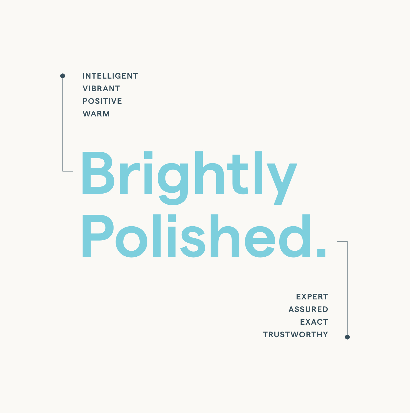

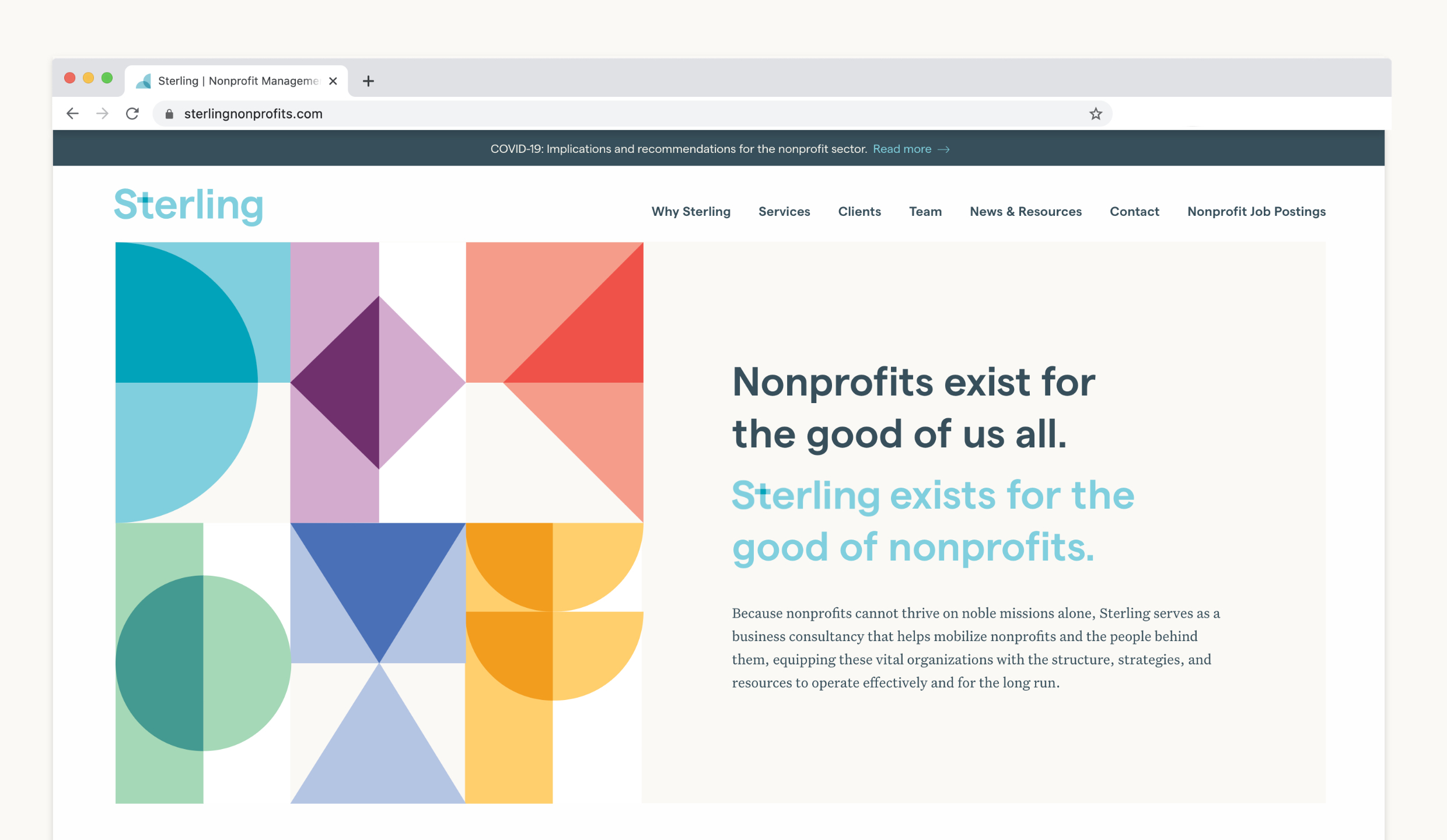
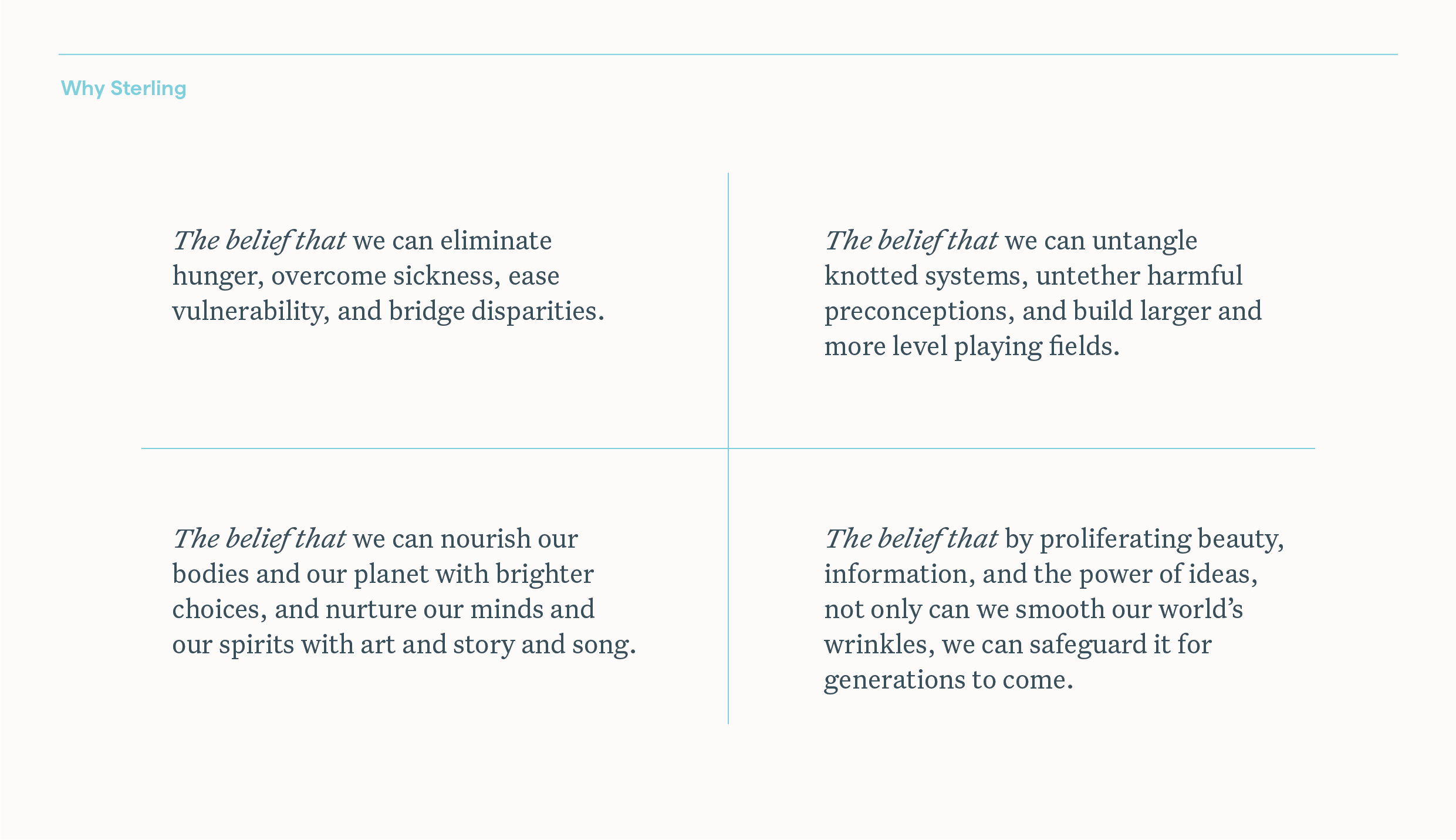
To echo the warmth and intelligence of their team, we identified their voice as Brightly Polished, moving them out of the world of corporate formality and into a confident, conversational sphere that celebrates their charisma and conviction.
Slideshow + Caption
1
of
2
Single Image + Caption
Text
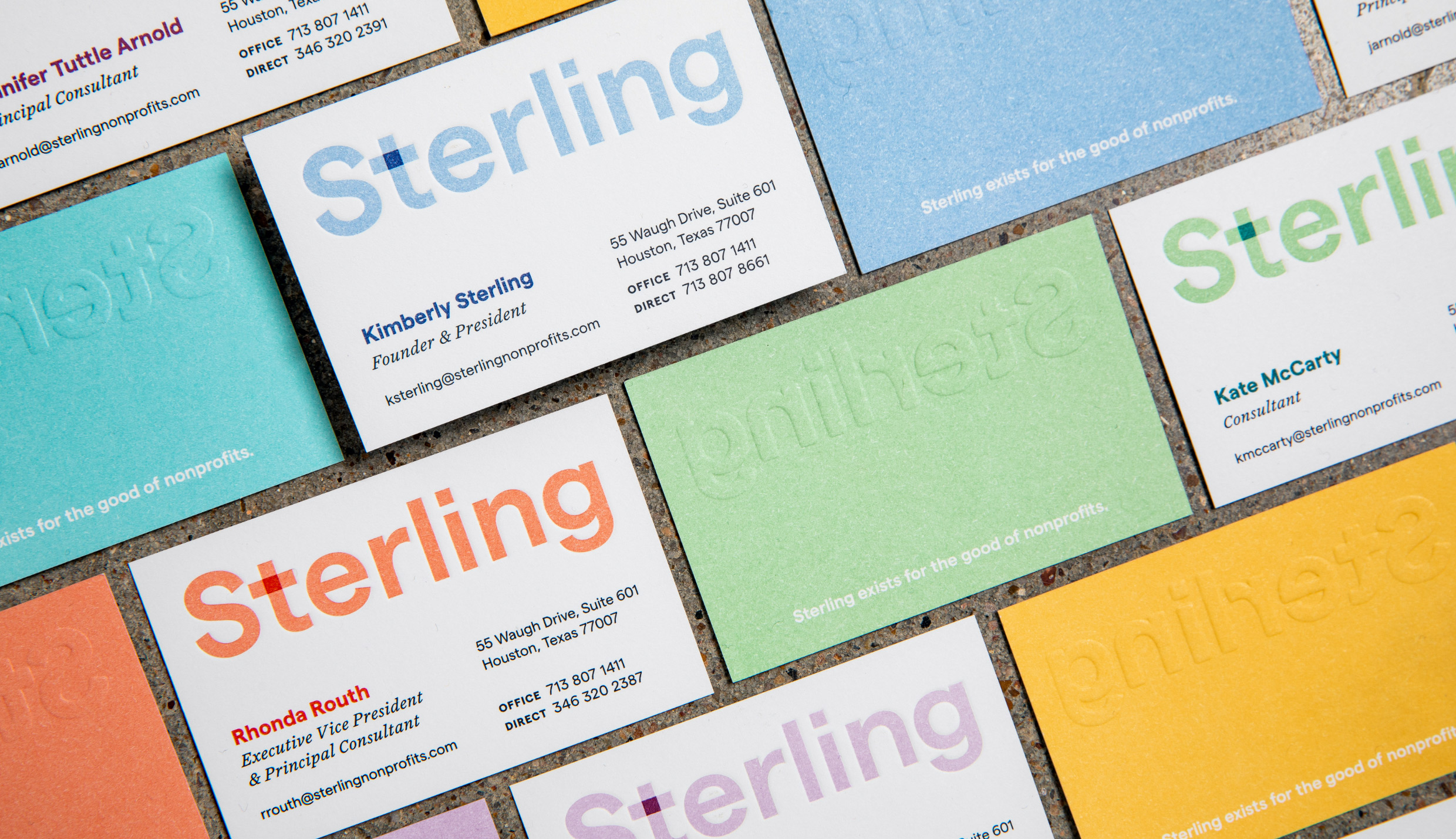
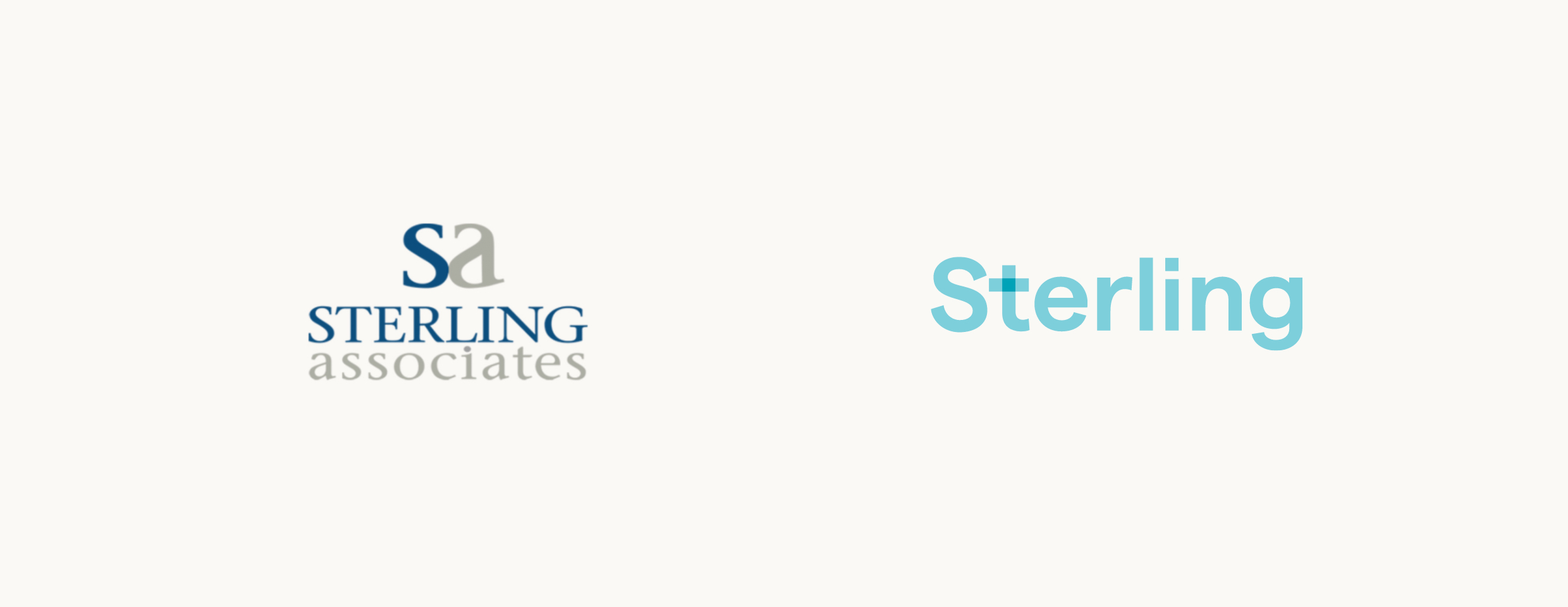
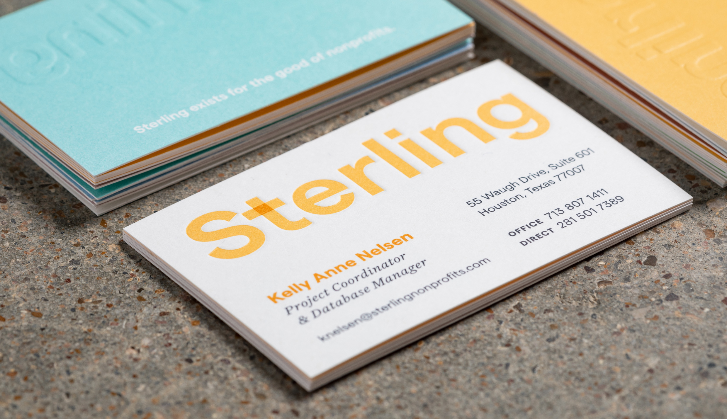
Their official name was Sterling & Associates, named after founder Kim Sterling, but everyone referred to them as “Sterling.” Simplifying their moniker focused attention on the promise of excellence inherent in their name and approach, while also future-proofing the brand for the next generation of Sterling leadership. A brand that champions the collective over the individual. The modified “t” in the wordmark nods to this spirit of transparency and collaboration.
Single Image + Caption
Text
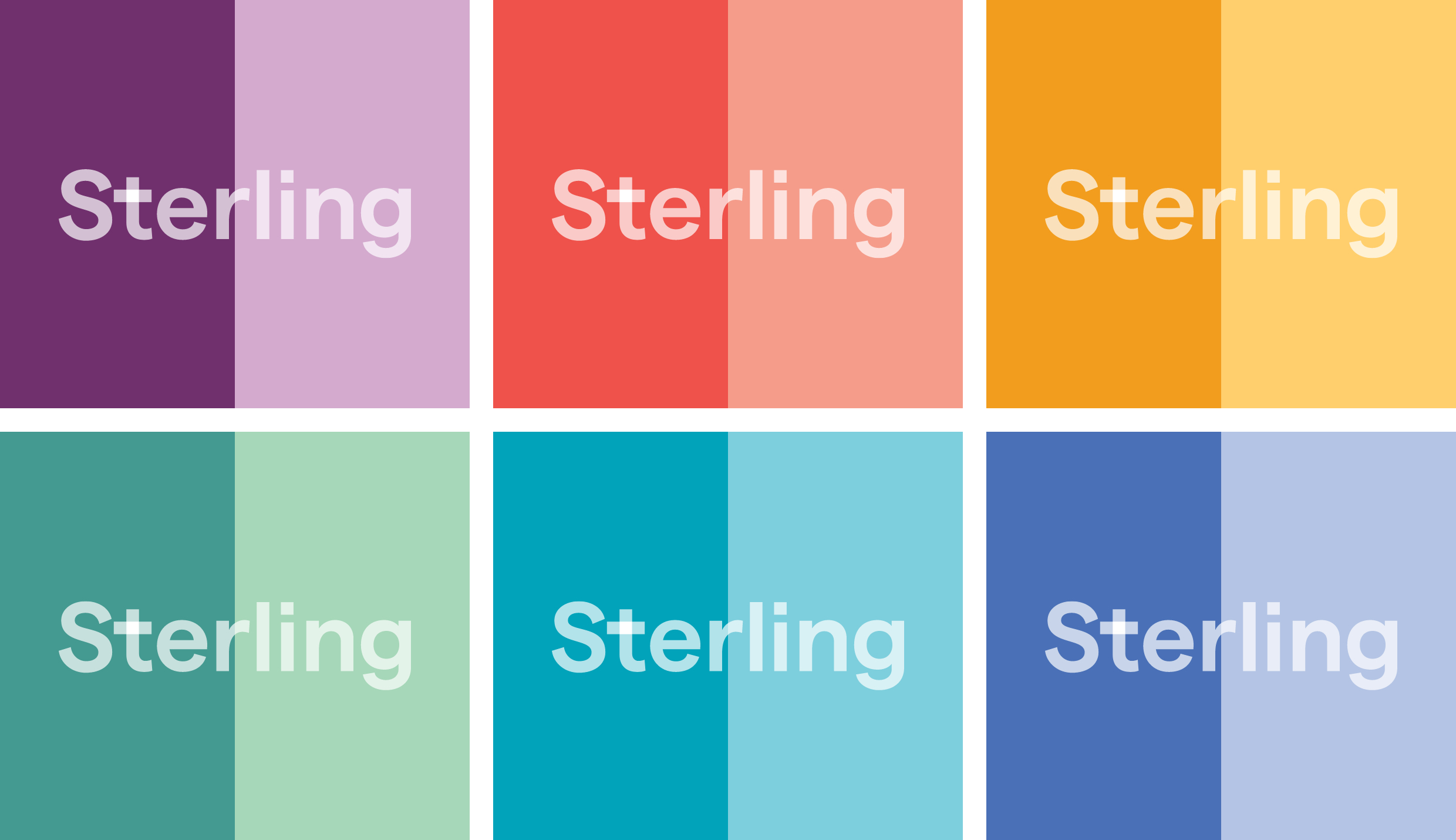
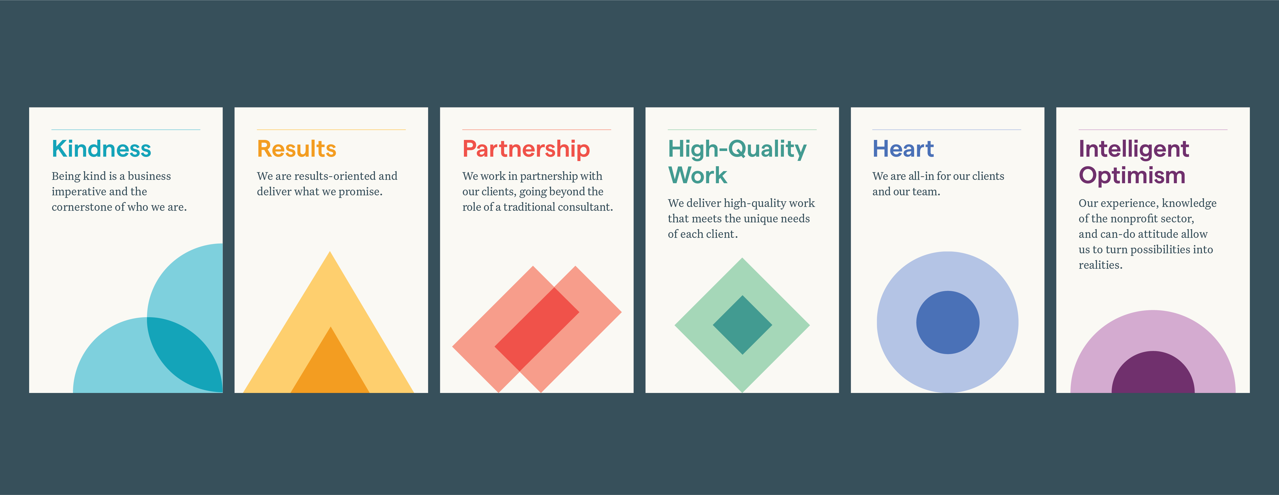
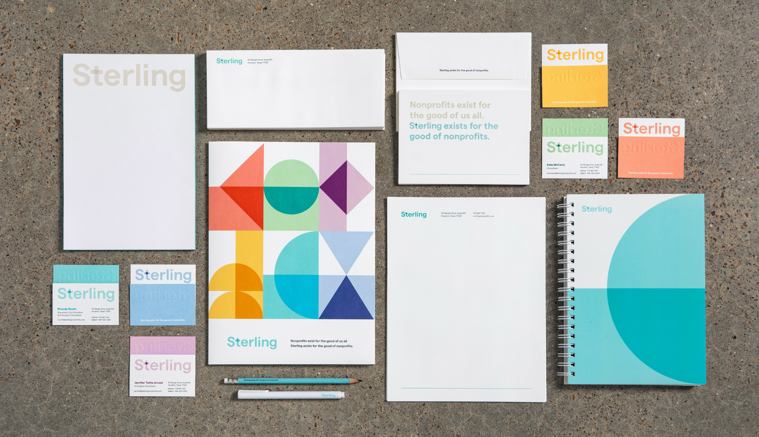
A palette of icons and shapes adds vibrancy and texture to the brand. Each icon is an abstract illustration of one of Sterling’s self-defined brand values; the kaleidoscope pattern represents the summation of these values and their profound integration into Sterling’s tight-knit culture.
Single Image + Caption
Single Image + Caption
Single Image + Caption
Slideshow + Caption
1
of
2
Large + Small Image


Slideshow + Caption
1
of
5
Single Image + Caption
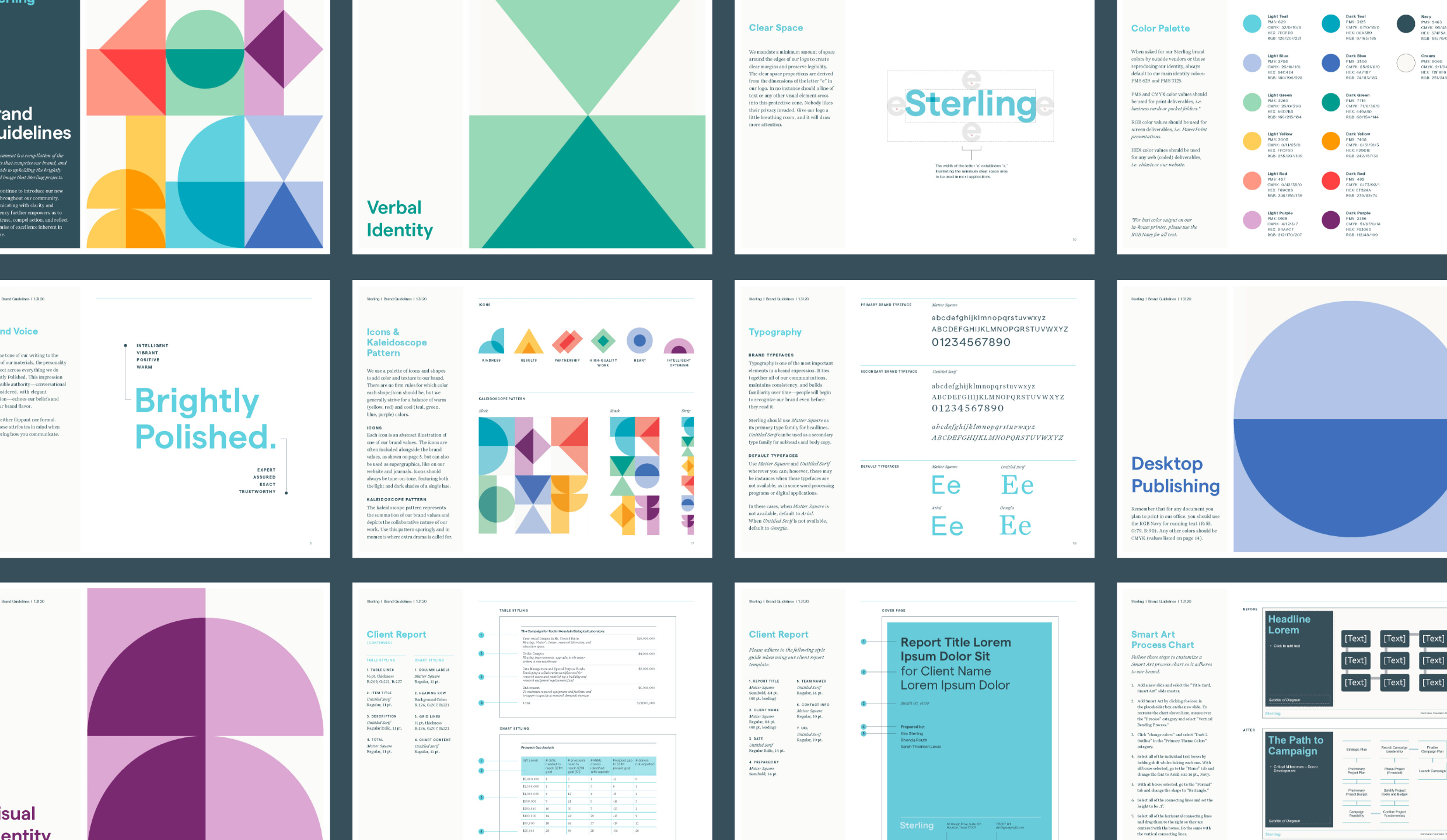
Excerpts from Sterling’s brand guidelines.
Small + Large Image
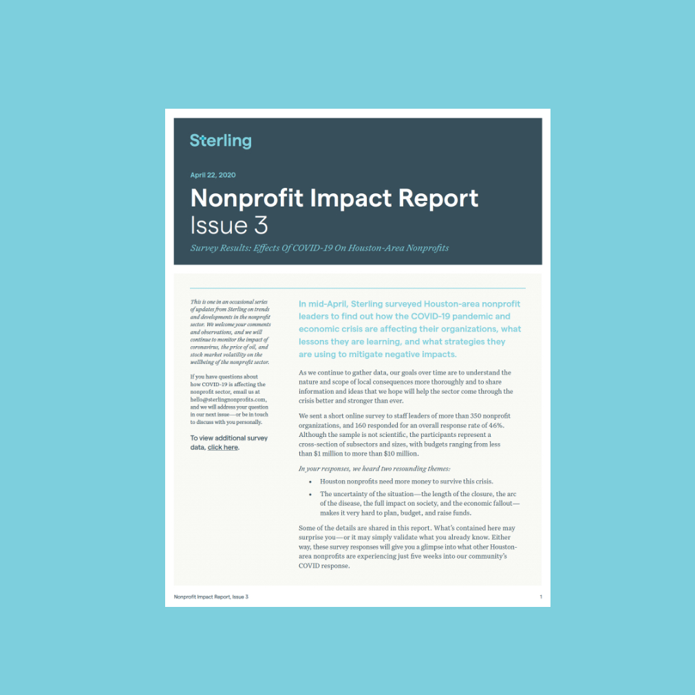
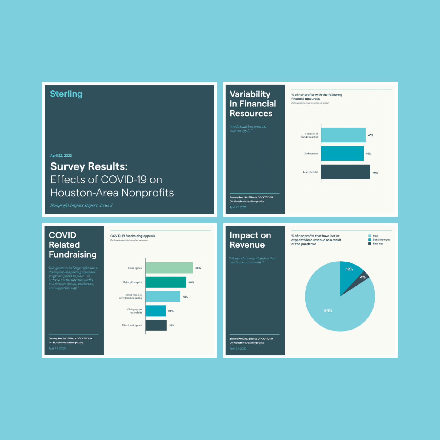
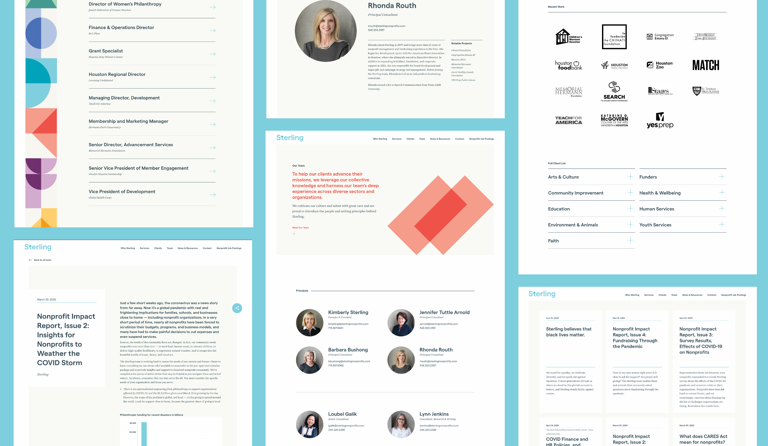
As a leader and resource in the nonprofit sector, Sterling frequently authors and distributes impact reports with updates and timely guidance. We helped design and edit a series of reports during the COVID-19 pandemic, which now serve as templates for future publications.
Left Image + Right Caption

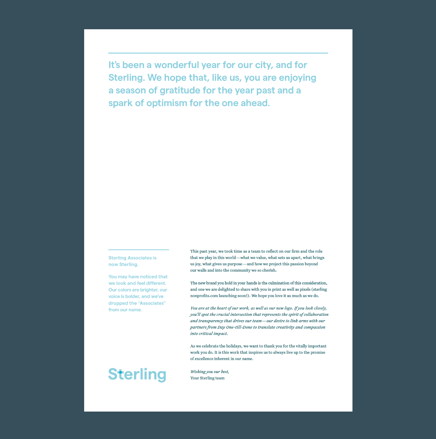
We launched Sterling’s new brand with a printed and digital holiday card, using it as an opportunity to introduce their new name and look, tease their upcoming website, and share heartfelt well-wishes for the year ahead.
Text
I’m almost never at a loss for words, but when we launched our new brand I found it hard to express my appreciation for the absolute excellence of Principle’s work or my gratitude to their team for capturing what we do and why it matters in a way that is beyond. I knew that they were something special, but little did I know just how amazing they could also make us feel about ourselves. Forever a fan, and more to follow!