People & Purpose
Based in Austin, Texas, Ryan Street Architects has served select residential and commercial clients since 2001, designing acclaimed spaces that range from stunning celebrity retreats and private communities (Lance Armstrong, Kendra Scott, Houston Oaks) to shared neighborhood favorites like Tiny Boxwoods (Austin). As Ryan’s eponymous firm approached twenty years, he wanted to reimagine their web presence entirely, including a brand overhaul. We strove to celebrate in equal measure the uncommon beauty of their portfolio and philosophy, centered in creating architecture that is as much an expression of a place as of the people within it.
Services
- Brand Strategy
- Verbal Identity
- Visual Identity
- Writing
- Website Design
- Print System
- Presentation Materials
- Signage
- Merch System
- Brand Guidelines
Partners
- Kudos NYC
- Megan Hotze Editorial
Left Image + Right Caption

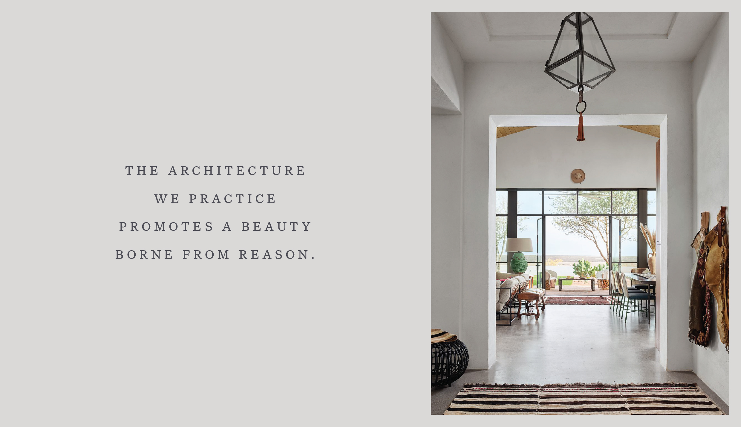
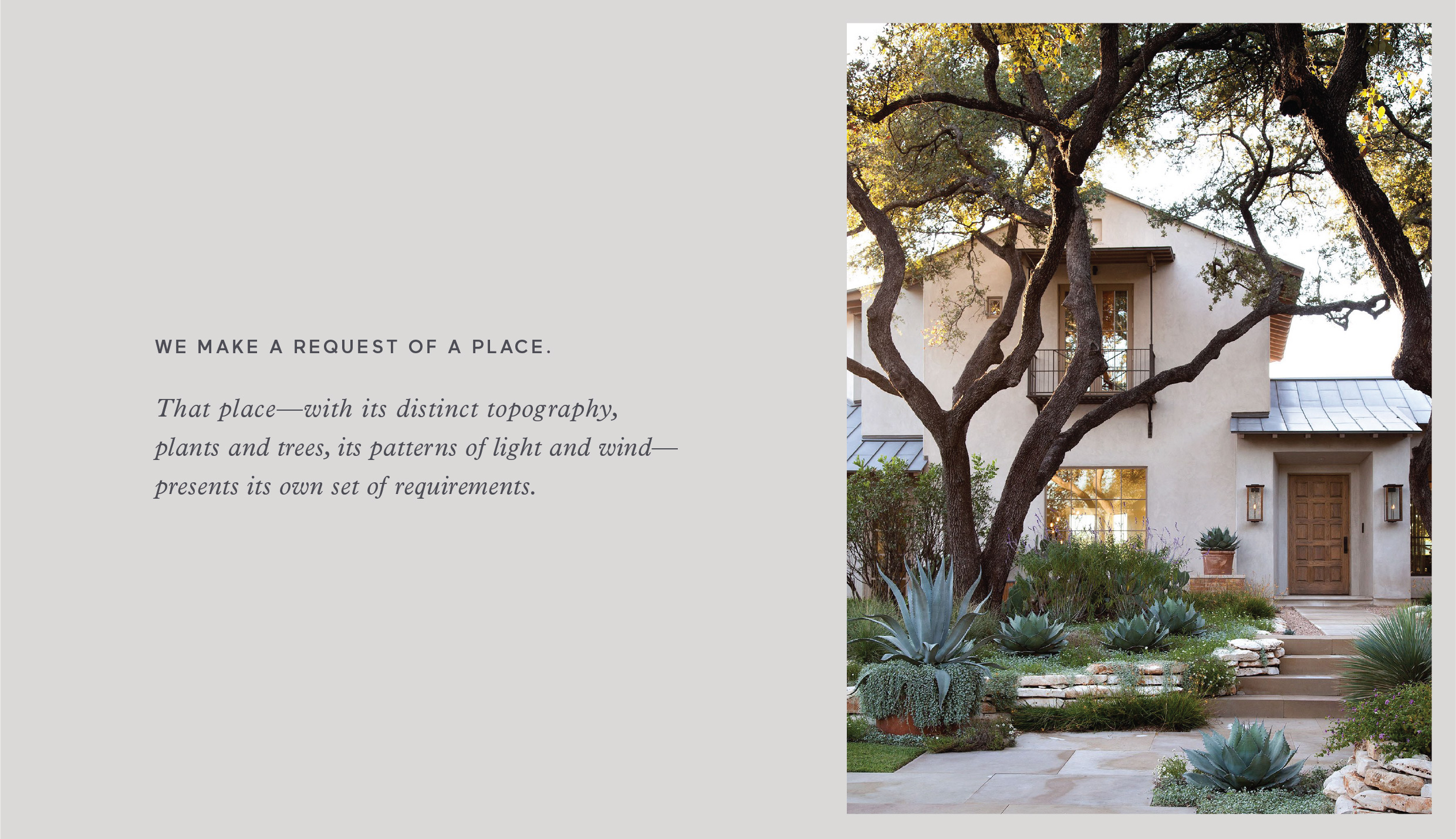
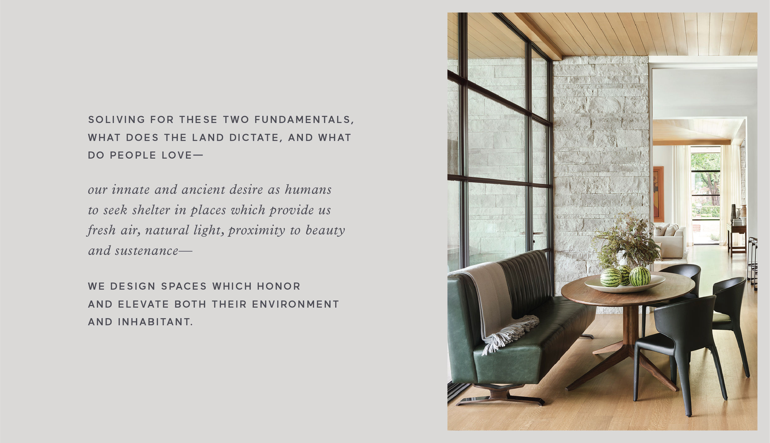
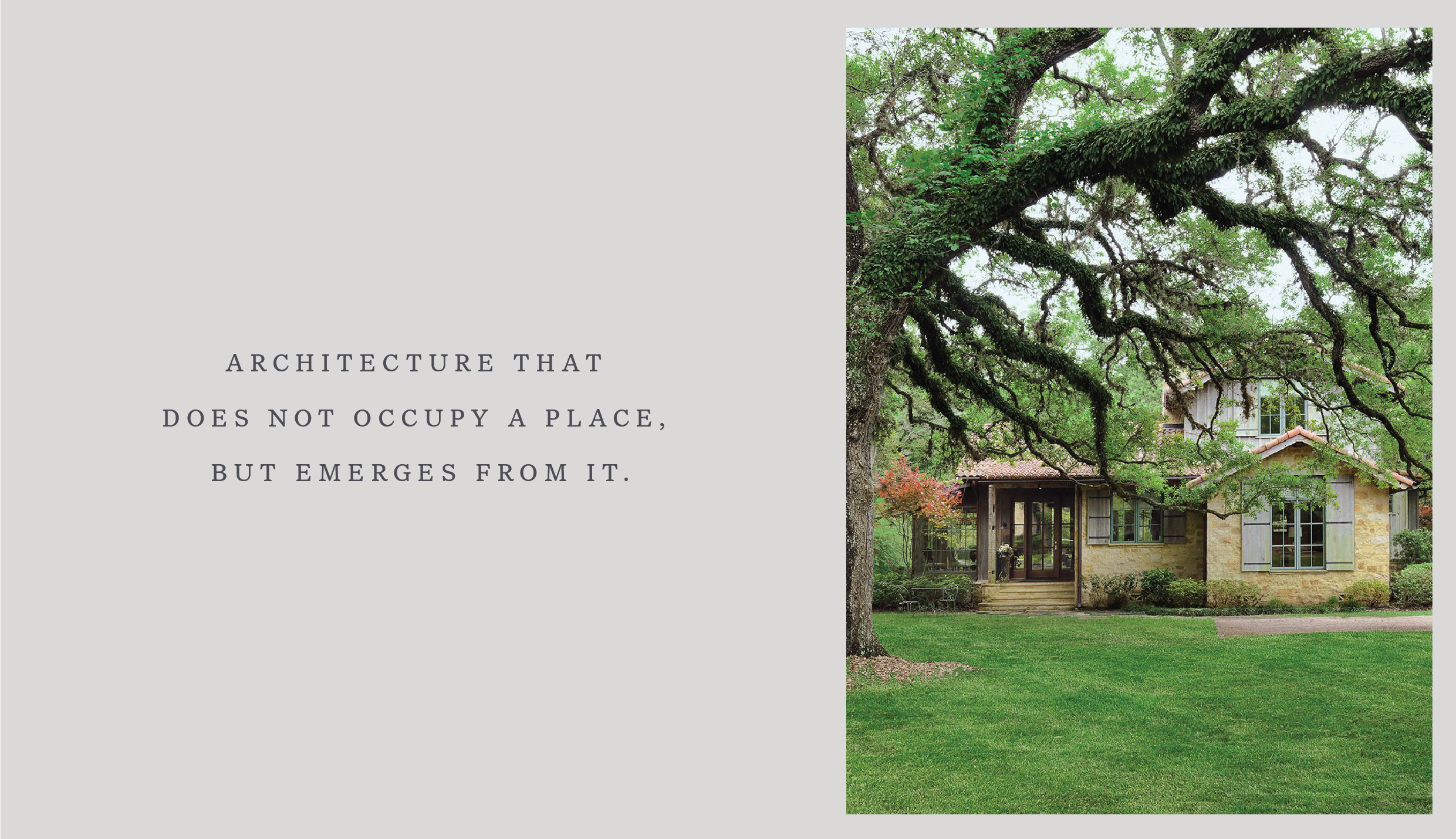
To listen to Ryan Street is to listen to both poet and pragmatist. As such, the voice for RSA is both art and method, evocative and slightly technical, human and softly elegant—one that feels like the luxury experience it speaks to. This voice is woven quietly throughout their new website, interspersed with dramatic imagery to draw you into his work and approach.
Single Image + Caption

Single Image + Caption
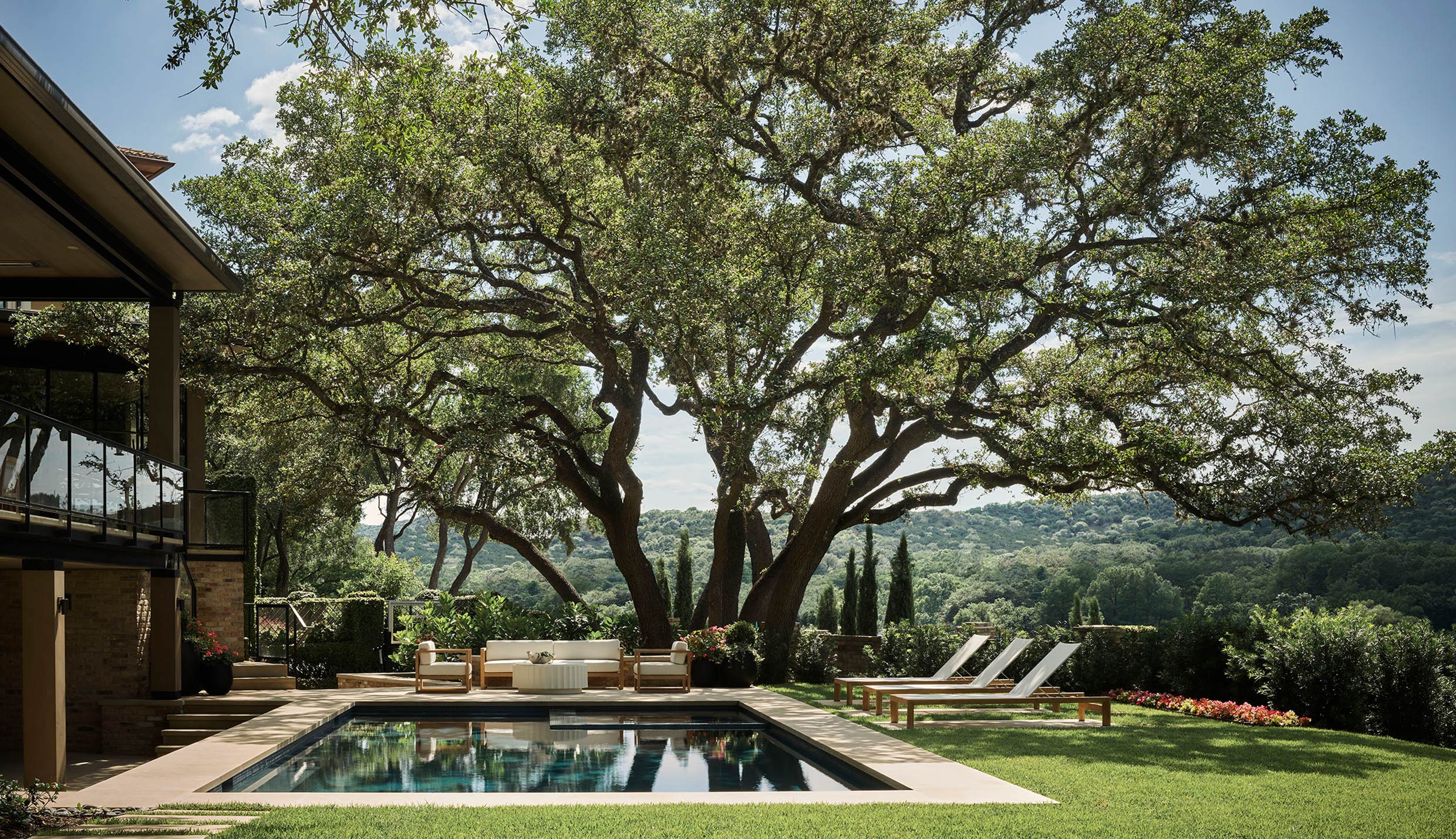
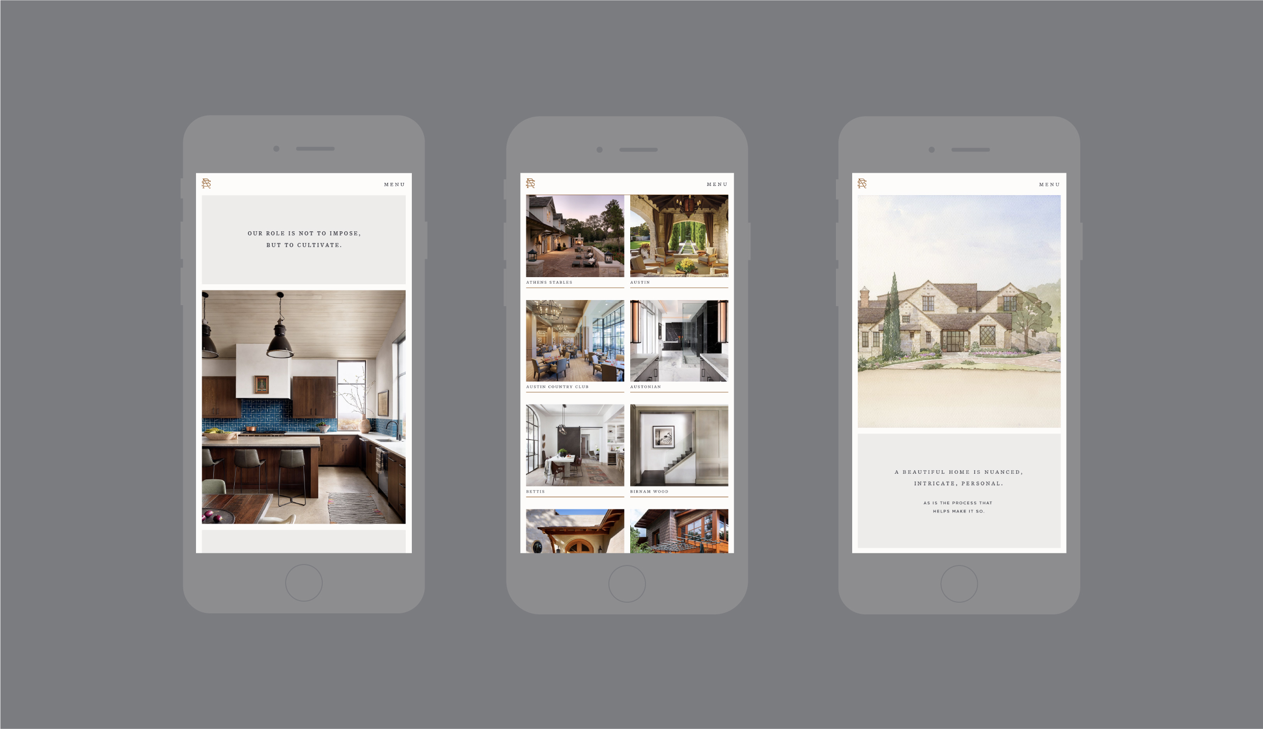
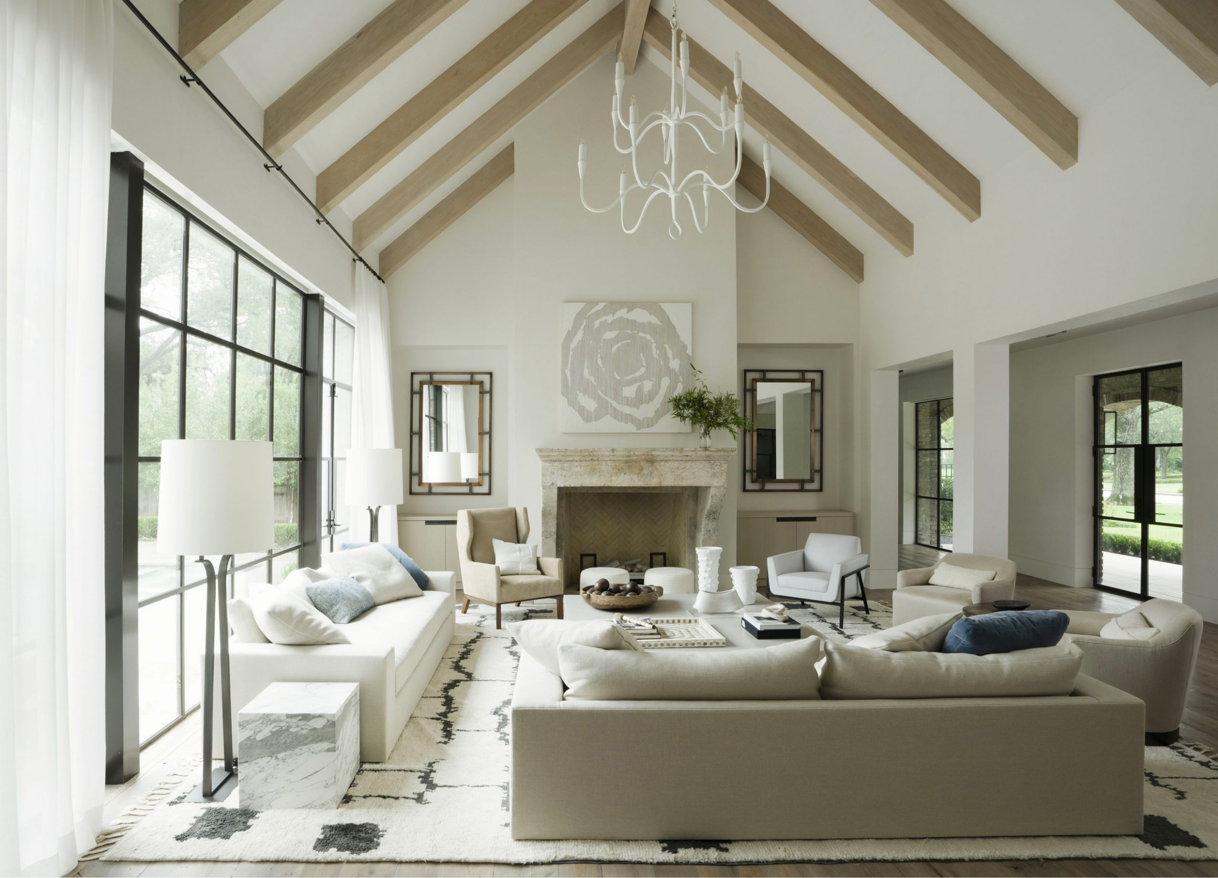
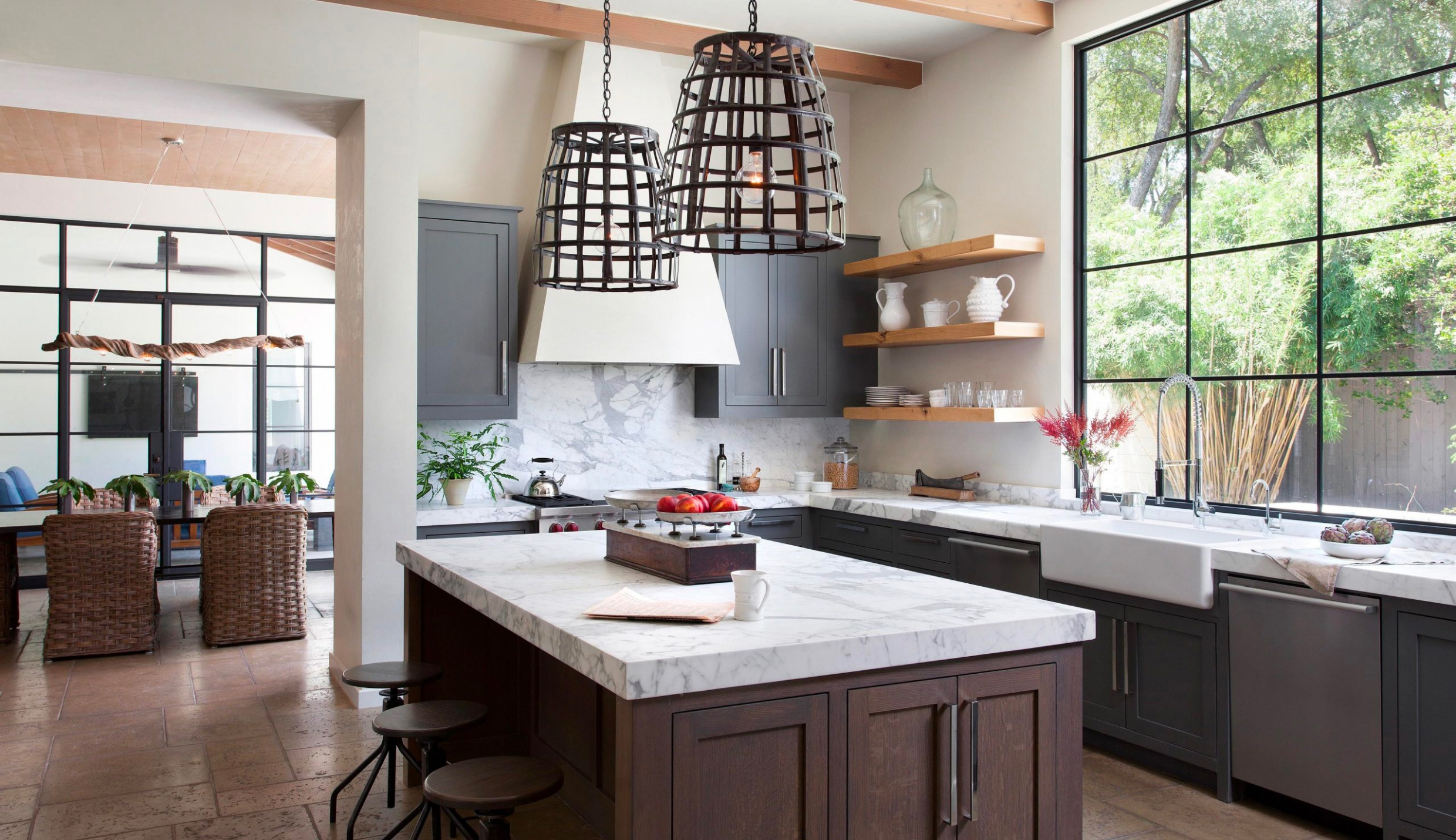
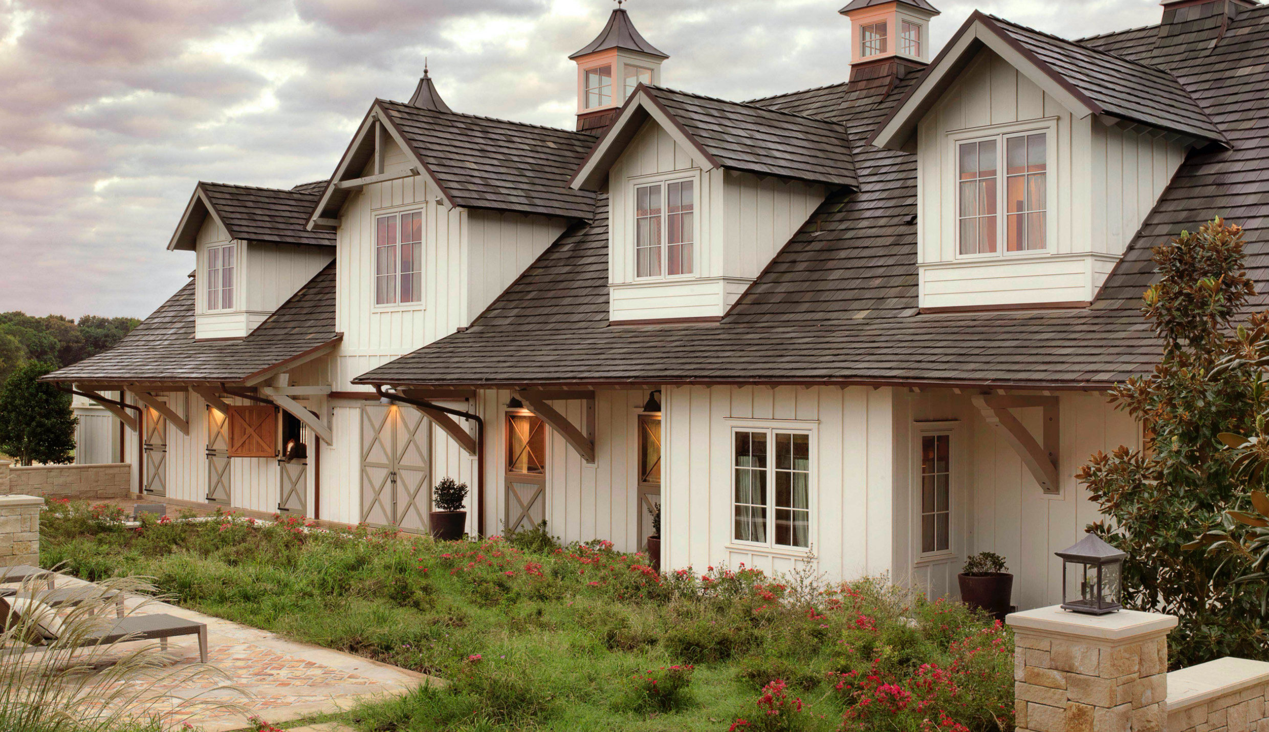
It was critical that the firm’s work be richly showcased across their site. To immerse the viewer in RSA’s dynamic portfolio, each project page offers three ways to explore their spaces: a meandering scroll, a bird’s-eye gallery, and a simple side-scroll with gorgeous wall-to-wall photography.
Single Image + Caption
Single Image + Caption
Text
A new monogram reflects RSA’s respect for the simple and hand-wrought—beauty that withstands the test of time. Its minimal nature gives it both a relaxed and regal feel, offering an extra touch of texture from paper to pixel.
Small + Large Image

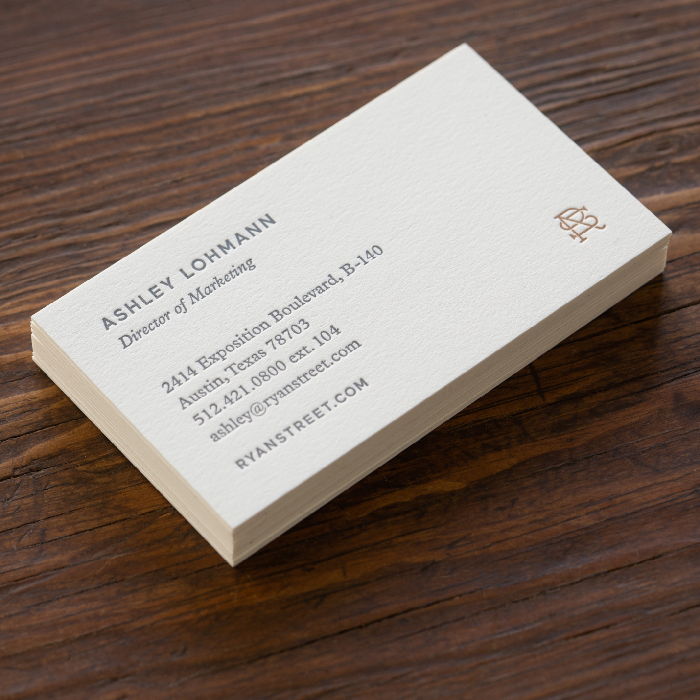
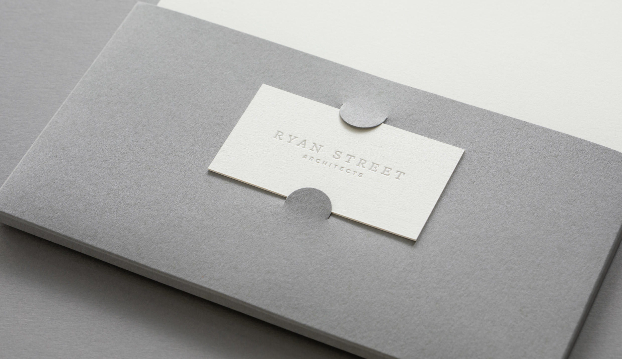
Typeset in a sure-footed, subtly chiseled serif, the name ‘Ryan Street’ is the foundation of the visual identity, underscored by a clean, crisp ‘Architects.’ A soft, neutral palette of color and paper blends ink with texture to yield an intentionally tonal collection of collateral.
Single Image + Caption

Larkspur and Maax: A handsome typographic pair selected for its easy elegance and legibility.
Left Image + Right Caption

A mix of print and fabrication techniques throughout the system juxtaposes suppleness and strength, matte and shine, quiet and contrast.
Single Image + Caption
Single Image + Caption
Single Image + Caption
Text
I want to tell you what a pleasure it is to see all of this excellent work start to be implemented—you have refined and refreshed our brand in ways that have exceeded my expectations. We have been so impressed with everyone and everything you’ve done for us, and I want you to know how grateful we are to have you as a part of our team.
