People & Purpose
Credence is Levi Goode’s flagship solo project under his personal brand. The ranch-inspired, fine-dining concept explores Levi’s perspectives on South Texas, where he and generations of his family have spent decades.
What makes Levi’s cooking and restaurants so special is what makes them so Texan—they are not just “this thing” or “that thing” but a lifetime layering of flavors and influences that point intimately to specific people, places, memories, and rituals that run deep through his family and heritage.
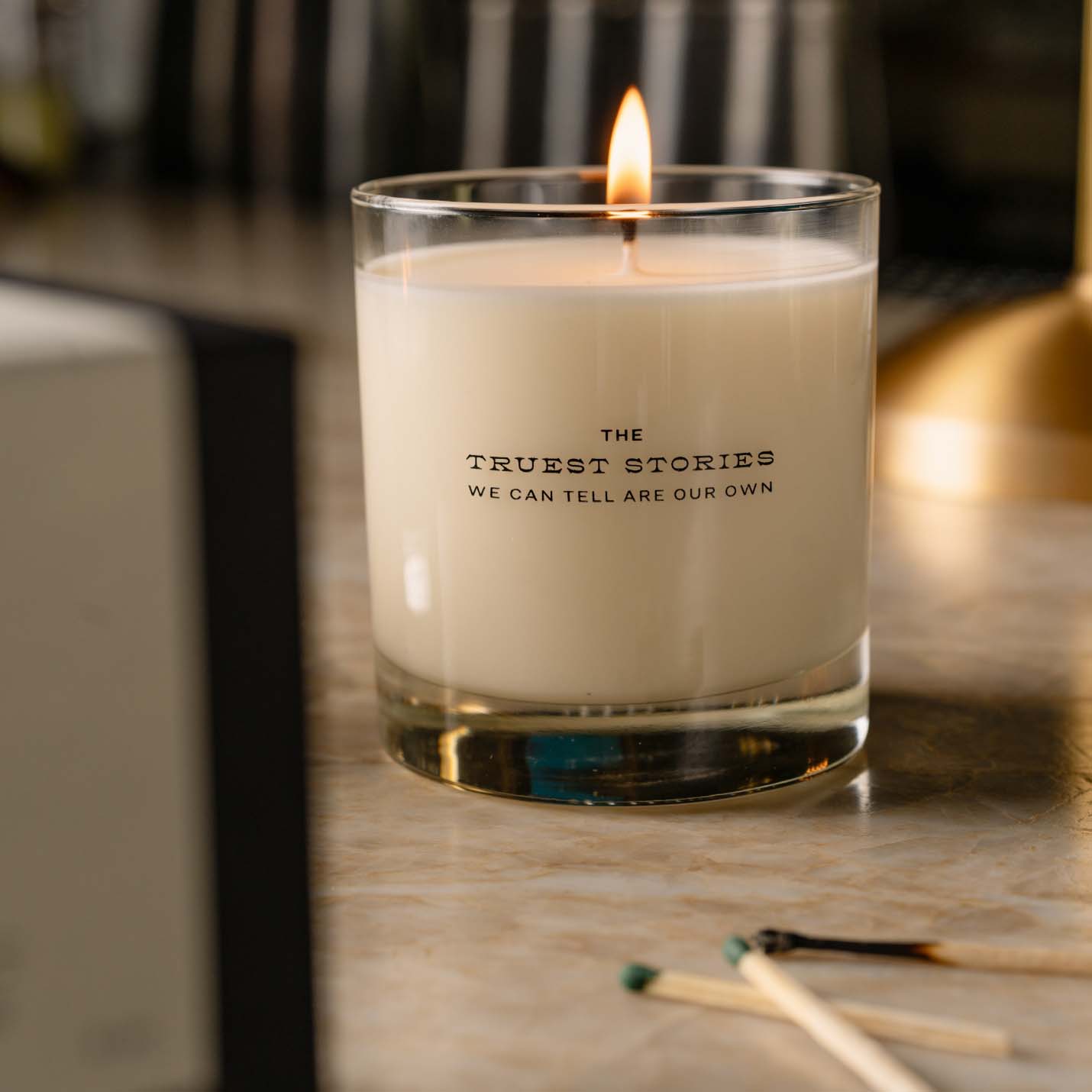
Defined as the belief in or acceptance of something as true, the name Credence surfaces the unusually personal, narrative ethos that runs through Levi’s entire house of brands while nodding to CCR, one of his favorite bands.
Services
- Naming
- Verbal Identity
- Visual Identity
- Writing
- Website Design
- Print System
- Signage
Partners
- Gensler
- Jonathan Schubert
- Kudos NYC
Left Image + Right Caption
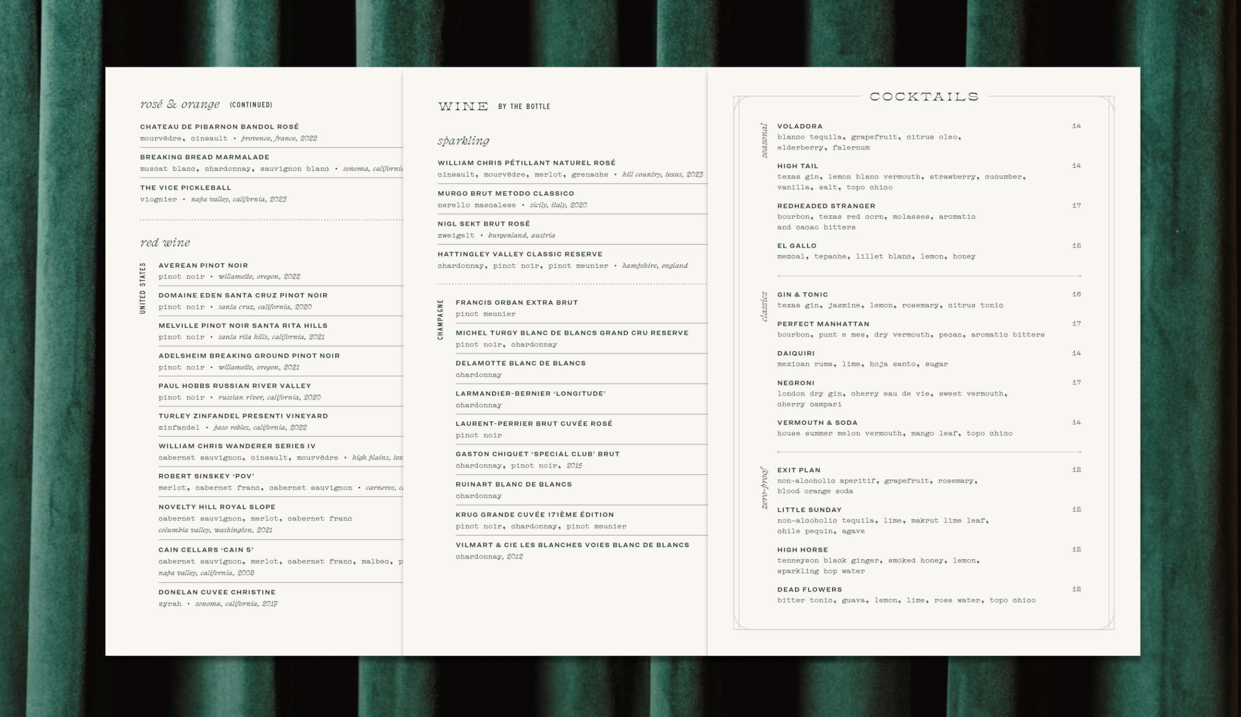
Credence’s typographic system is literally and aesthetically collected. When mixed and applied strategically, the four eclectic typefaces imbue written matter with a robust sense of brand and place—the mingling of roots, the layering of flavors, the refinement of style and skill through generations, the grit, the lore, the next chapter of Levi’s story.
Single Image + Caption
Single Image + Caption
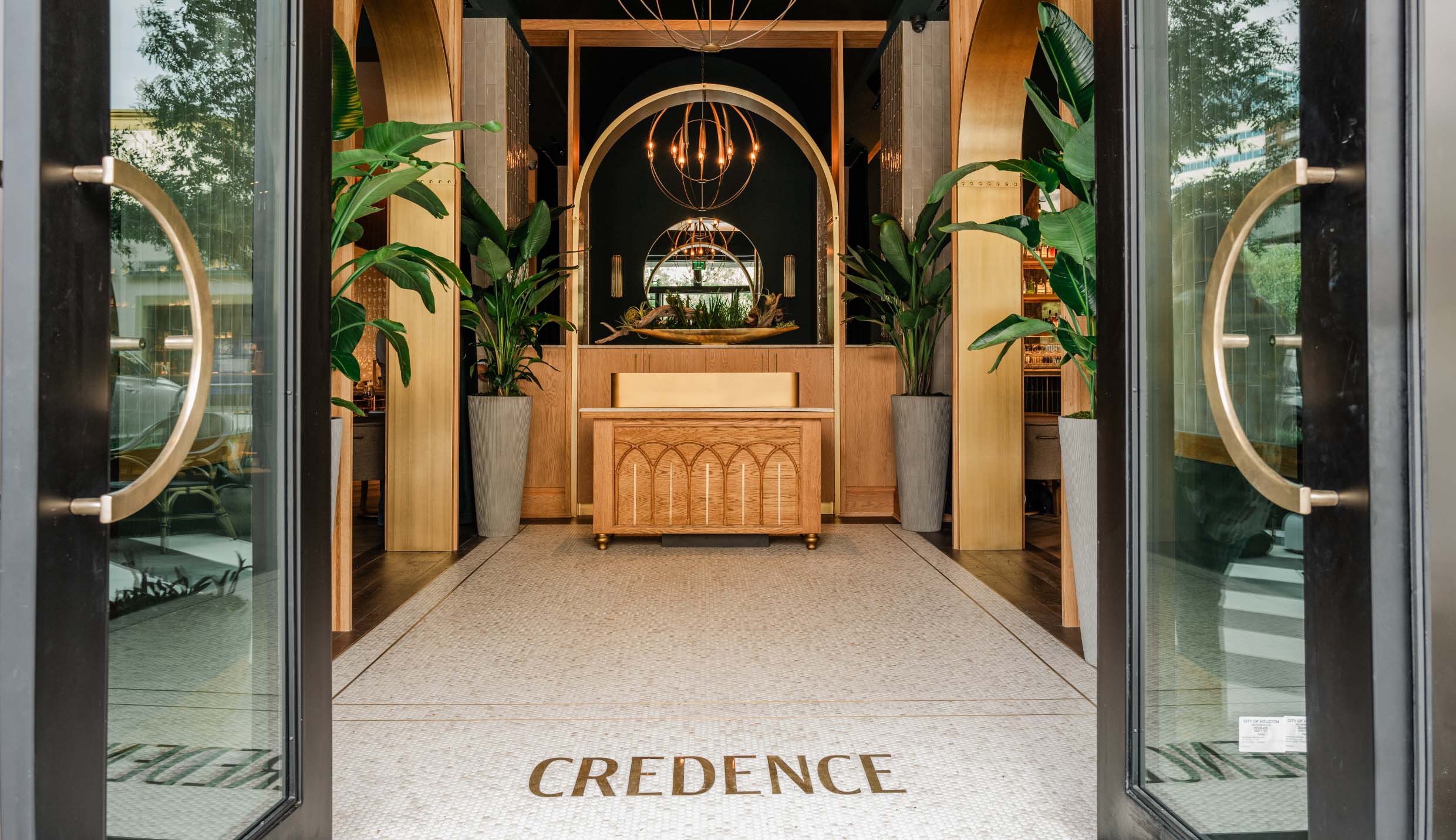
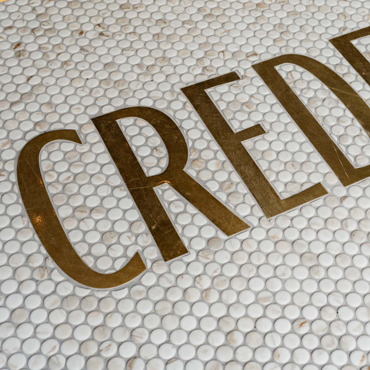
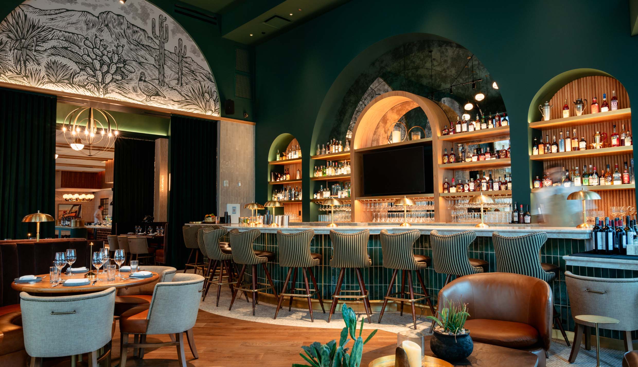
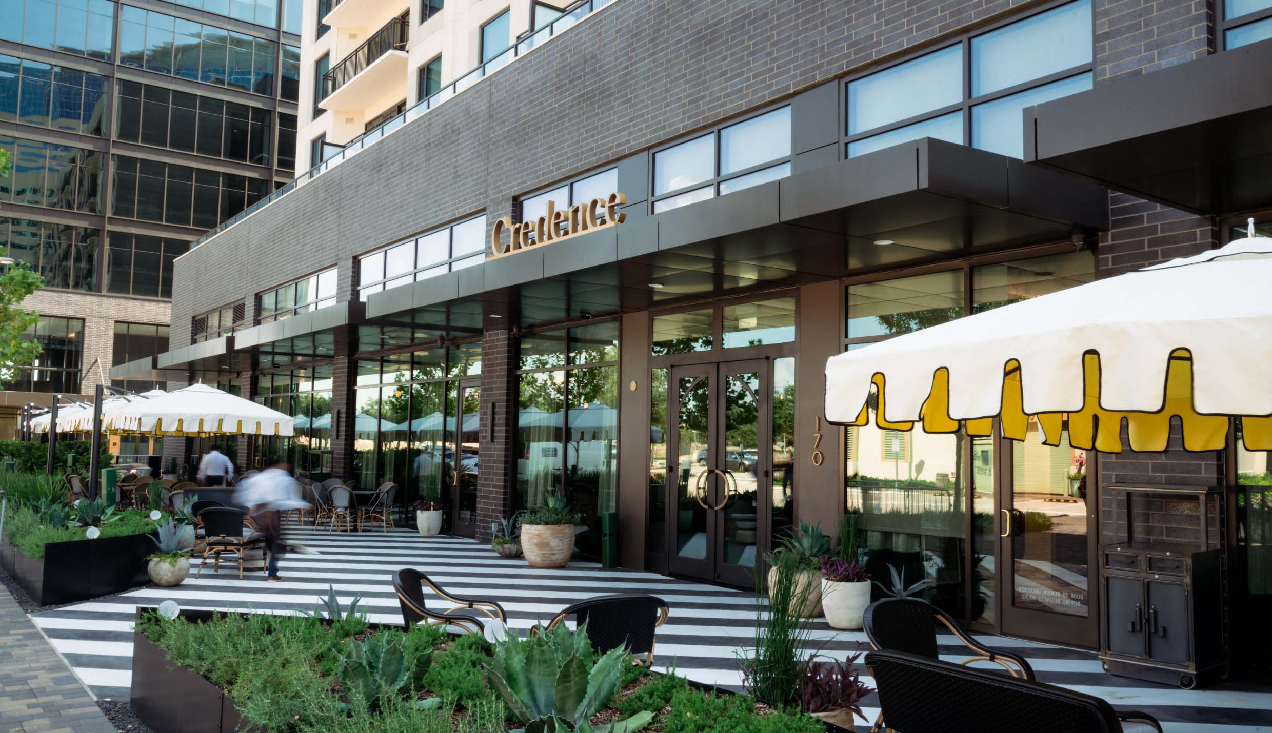
We collaborated with project architect Gensler on many environmental elements to ensure that the brand was threaded through the space.
Single Image + Caption
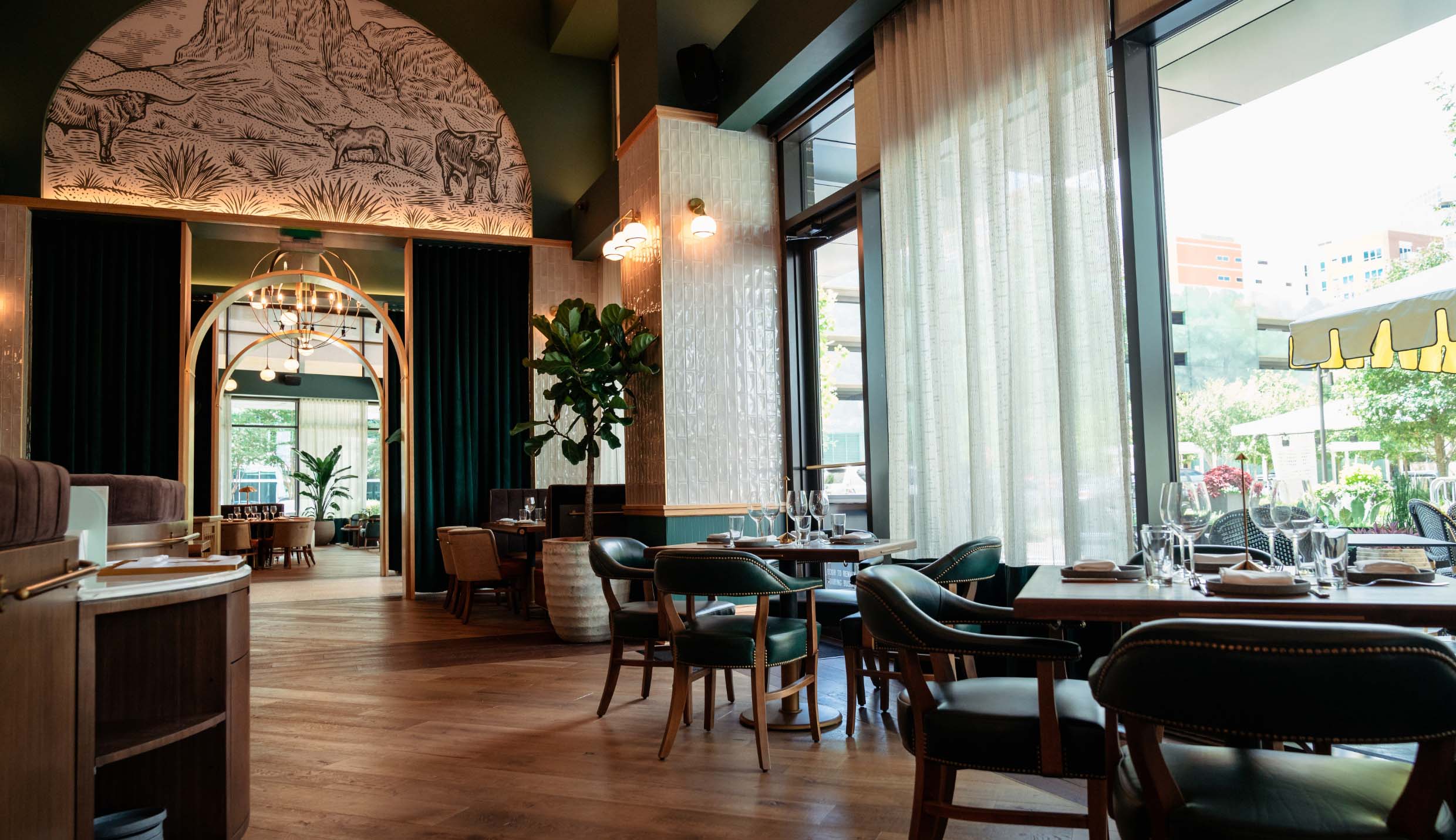
Jonathan Schubert was commissioned to illustrate custom wallpaper depicting southwestern landscapes for multiple arches within Credence.
Large + Small Image
Single Image + Caption
Single Image + Caption
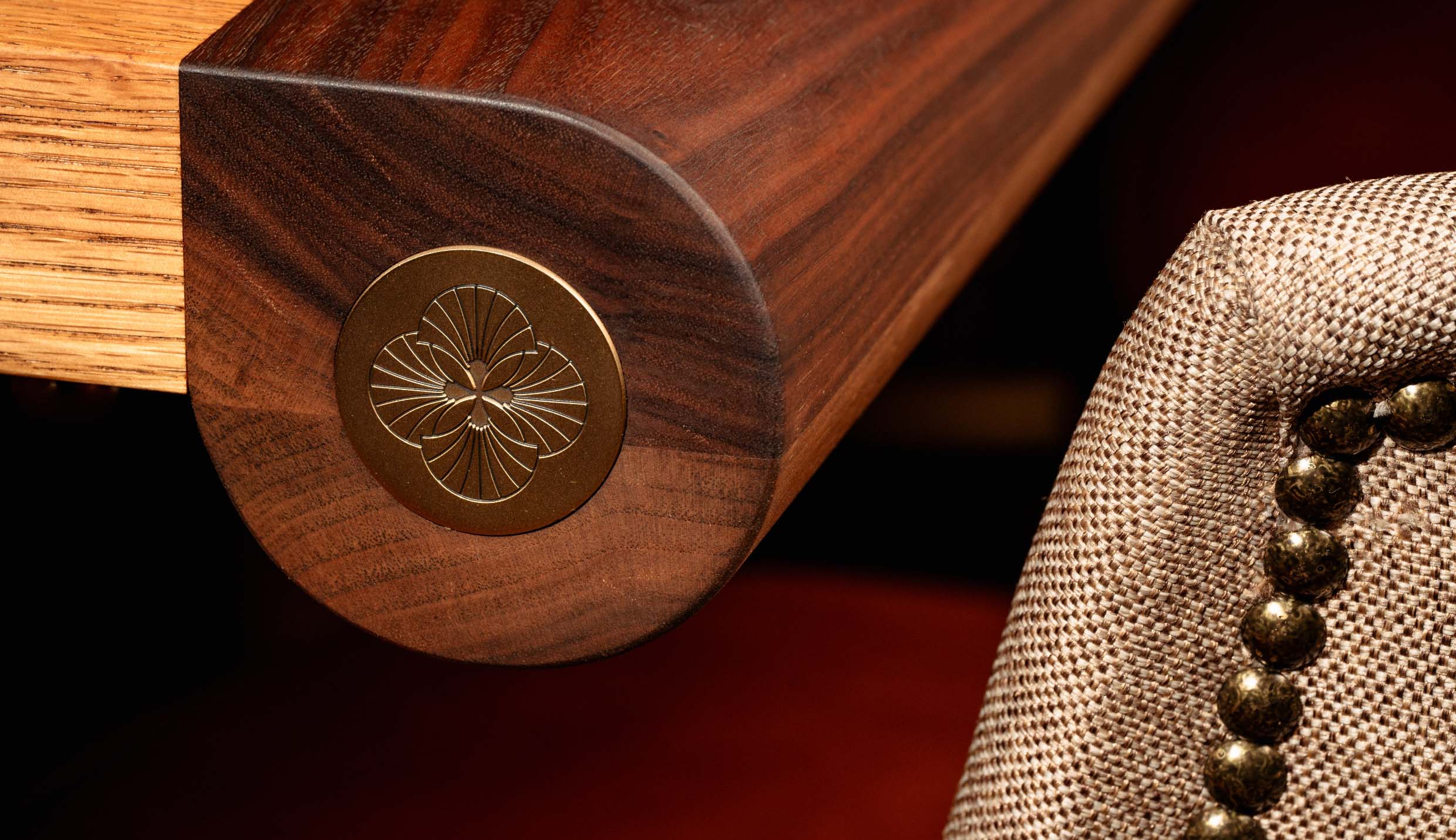
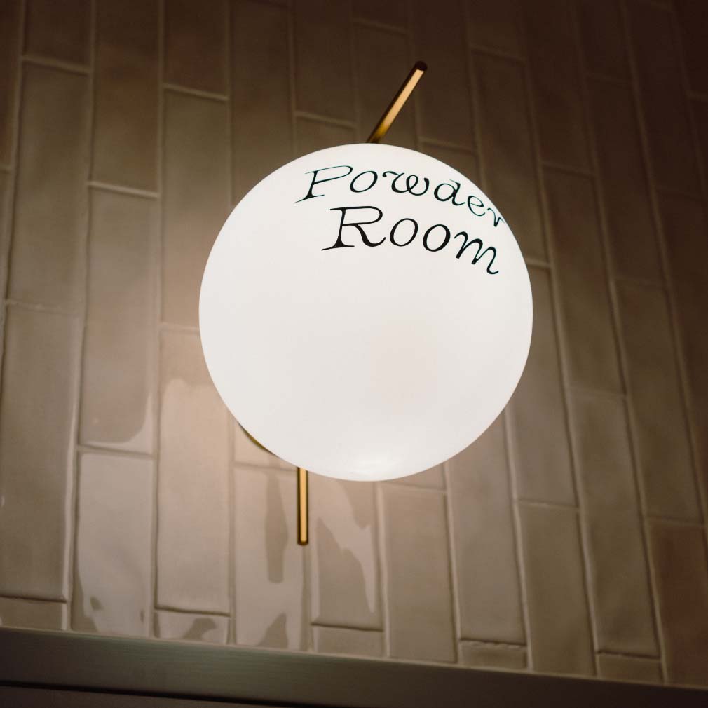
Credence’s interior details are an extension of highly considered brand elements.
Small + Large Image
Single Image + Caption
Large + Small Image