People & Purpose
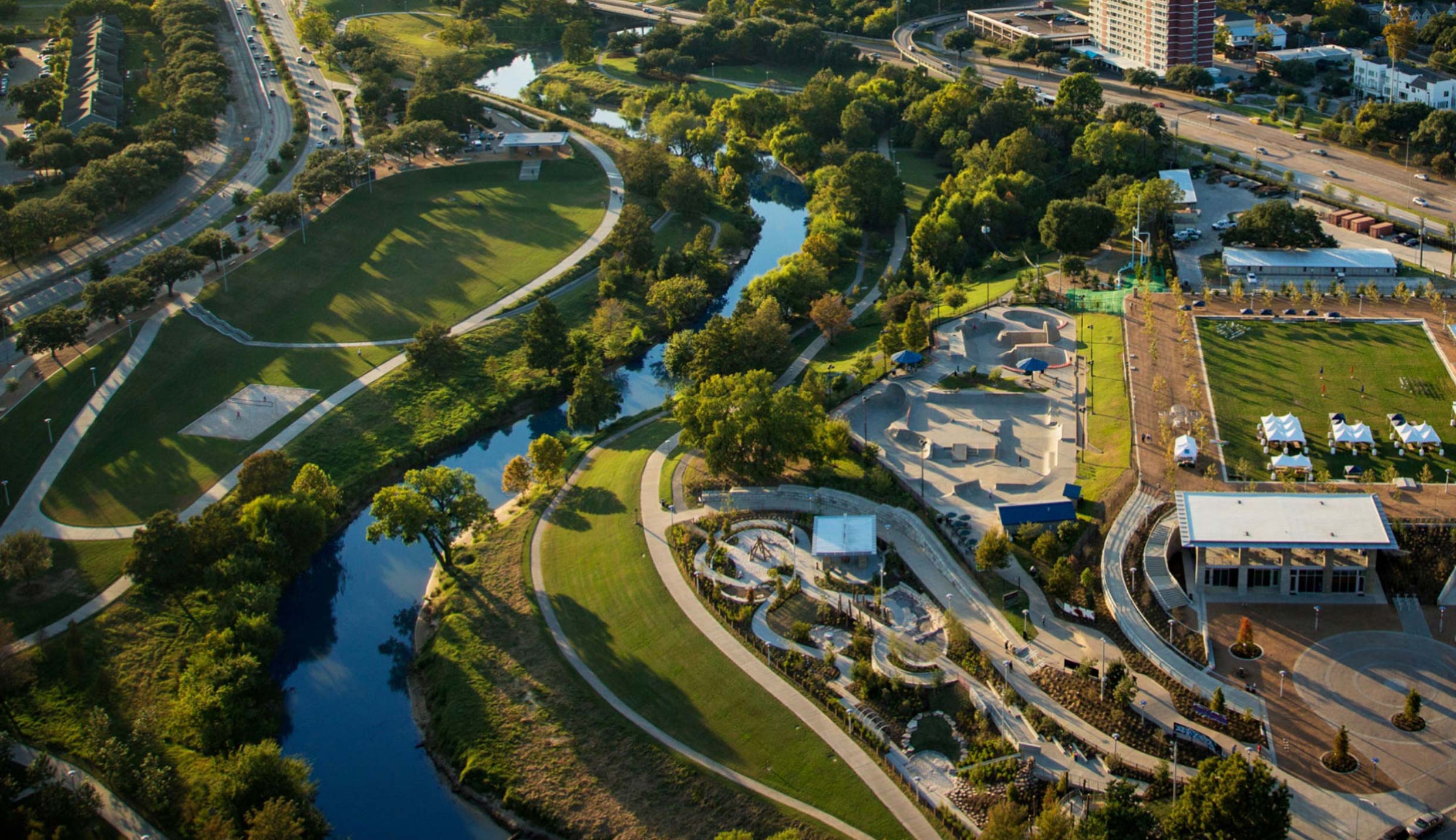
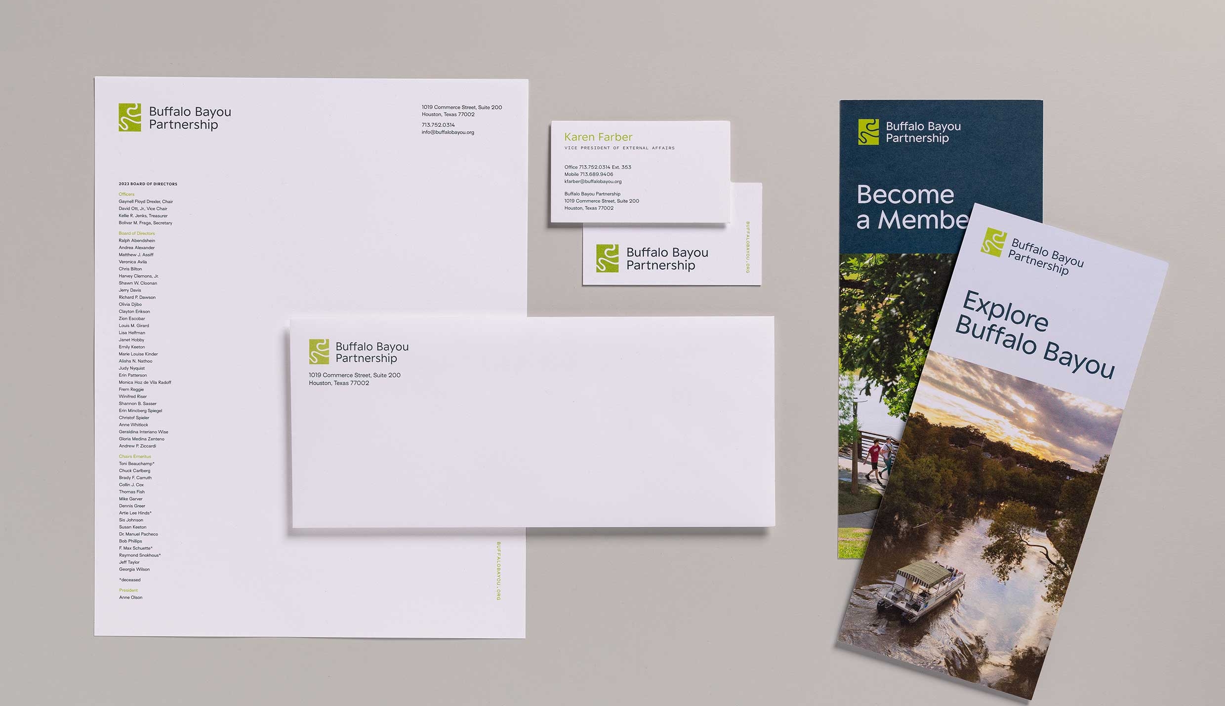
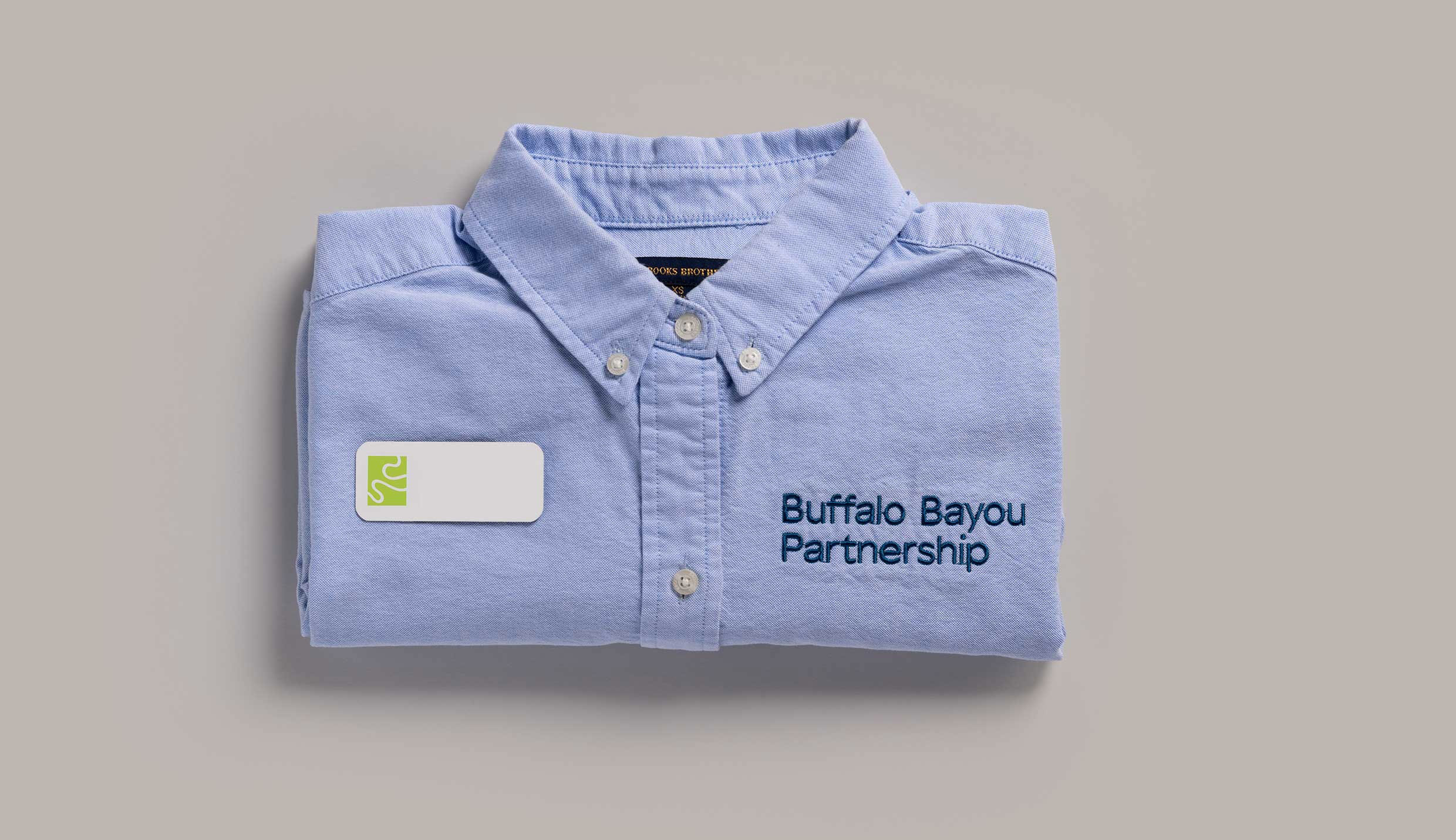
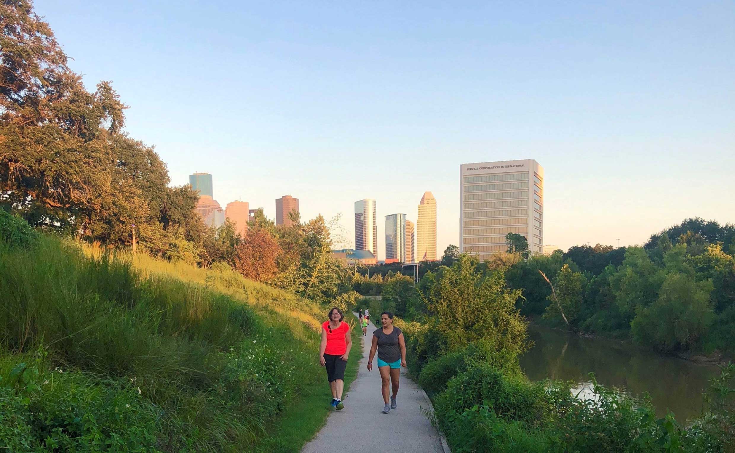
Threaded through Houston are more than 2,500 miles of waterways, bayous, and tributaries that spurred the city’s transformation from a sleepy port town into a thriving metropolis, and that have in recent years re-emerged as vital conduits for community, recreation, and repose. Leading this work is Buffalo Bayou Partnership (BBP), a visionary nonprofit organization committed to reinvigorating and sustaining a 10-square mile network of natural and urban spaces along Houston’s most iconic 52-mile waterway. BBP’s endeavors continue to expand geographically, touching more communities throughout our vibrant city. It was an honor to partner with BBP to create a new brand that captures the depth and breadth of their efforts, that can flex to meet their needs as they continue to grow and evolve.
Services
- Brand Strategy
- Verbal Identity
- Visual Identity
- Writing
- Website Design
- Print System
- Presentation Materials
- Brand Guidelines
Partners
- Kudos NYC
- Bayou photography courtesy of Buffalo Bayou Partnership
Left Image + Right Caption
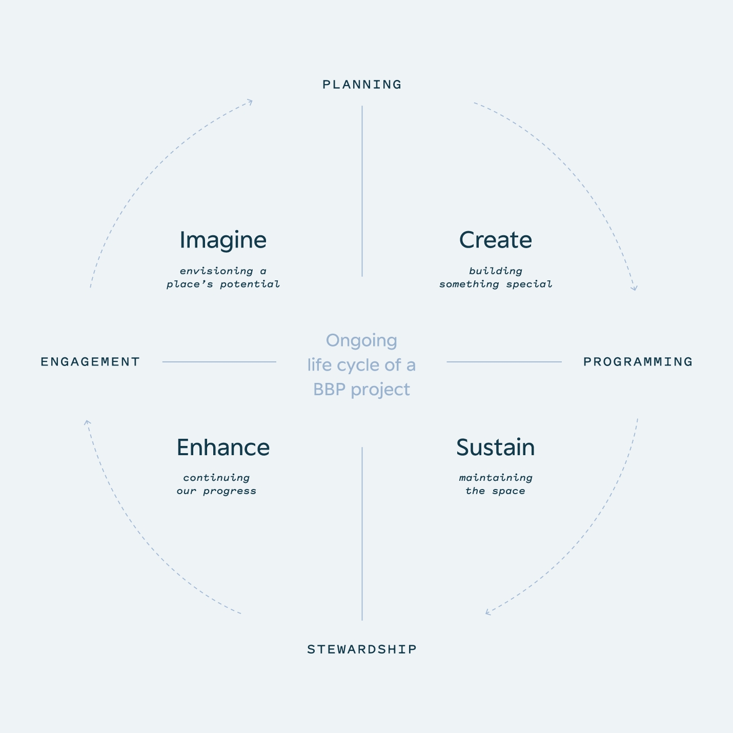
Our work to simplify and champion the BBP brand started with several central identity questions such as what do we do and how? and why do we exist?, the study of which formed the foundation for verbal and visual identity work.
Text
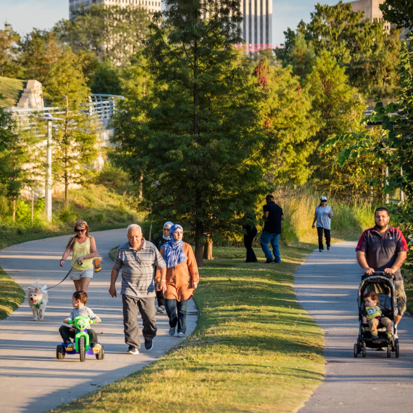
Reimagining BBP’s logo involved tracing—and embracing—the evolution of the organization’s impact over the last 30 years. Today, thanks to the transformational work of BBP, the bayou plays a crucial role by inspiring people to get outside, helping them feel welcome and safe, and connecting communities across the city.
As the primary visual anchor of the brand system, BBP’s logo now fully aligns the organization’s visual identity with its role in Houston—and with this sweeping objective: to affect positive social, economic, and environmental change.
Single Image + Caption
Left Image + Right Caption
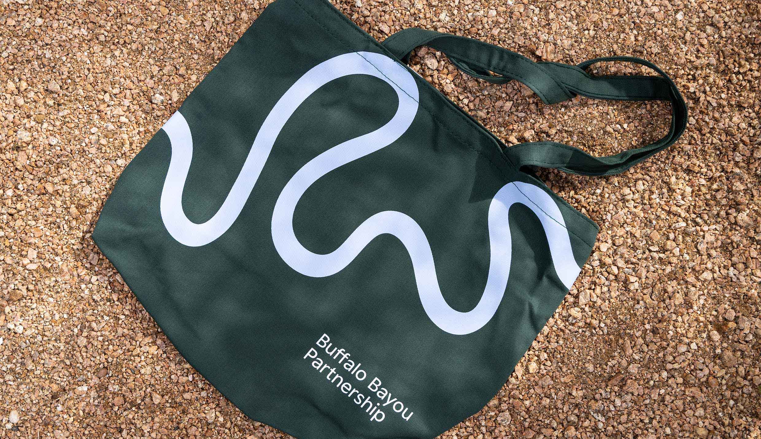
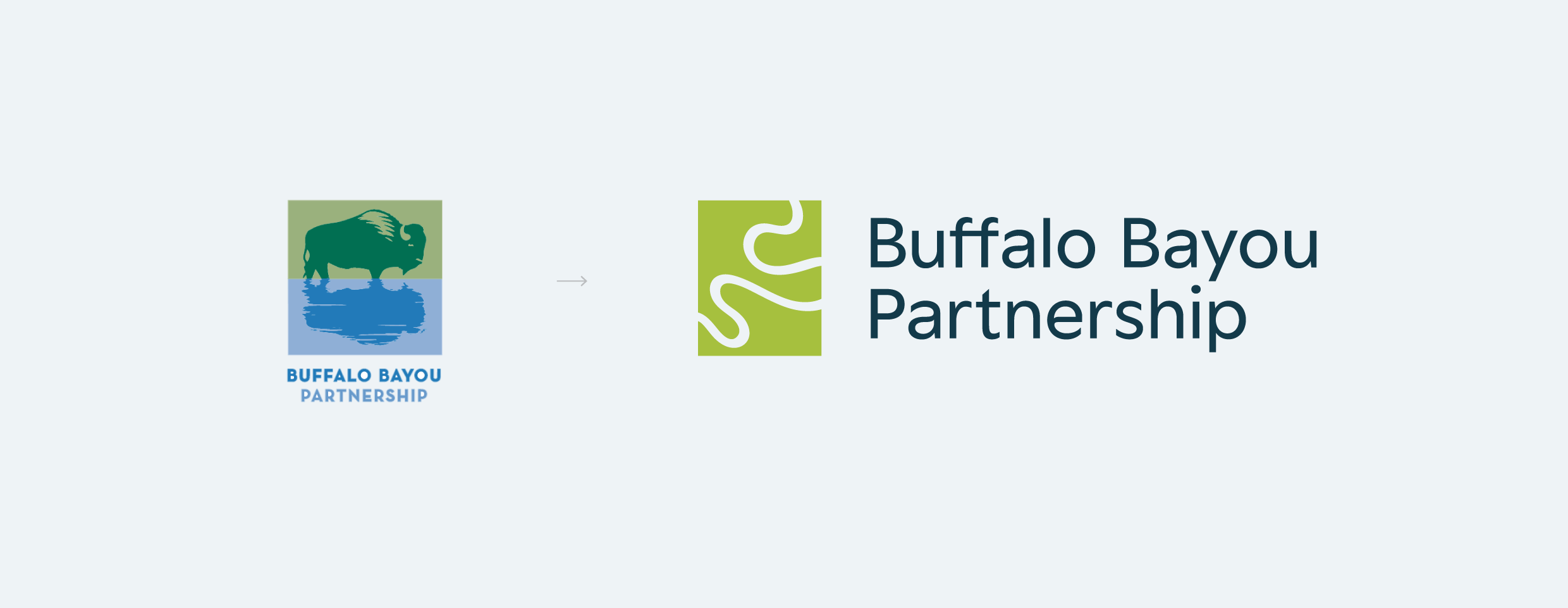
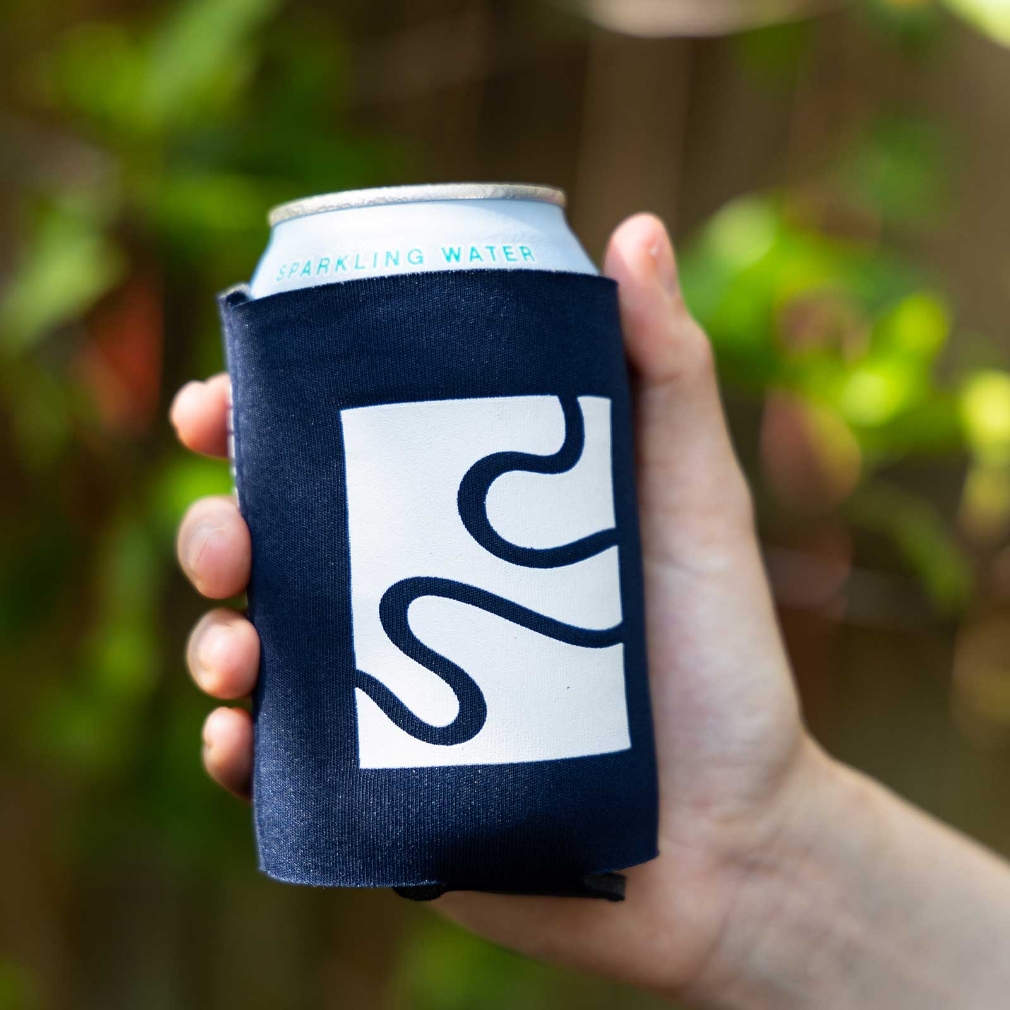
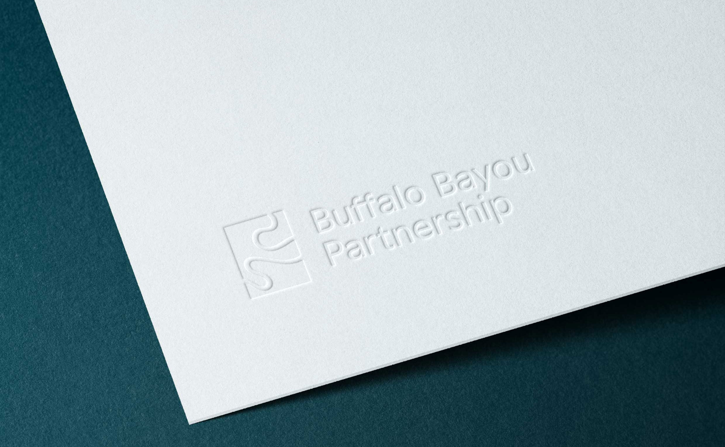
While the previous buffalo logotype possessed inherent limitations related to color, scalability, and proportion, the new “thread” mark is optimized for broad digital and print usage. Inspired by the natural undulations and varying curves of the bayou, the mark evokes movement and action. It is forward-looking and full of hope.
Single Image + Caption
Text
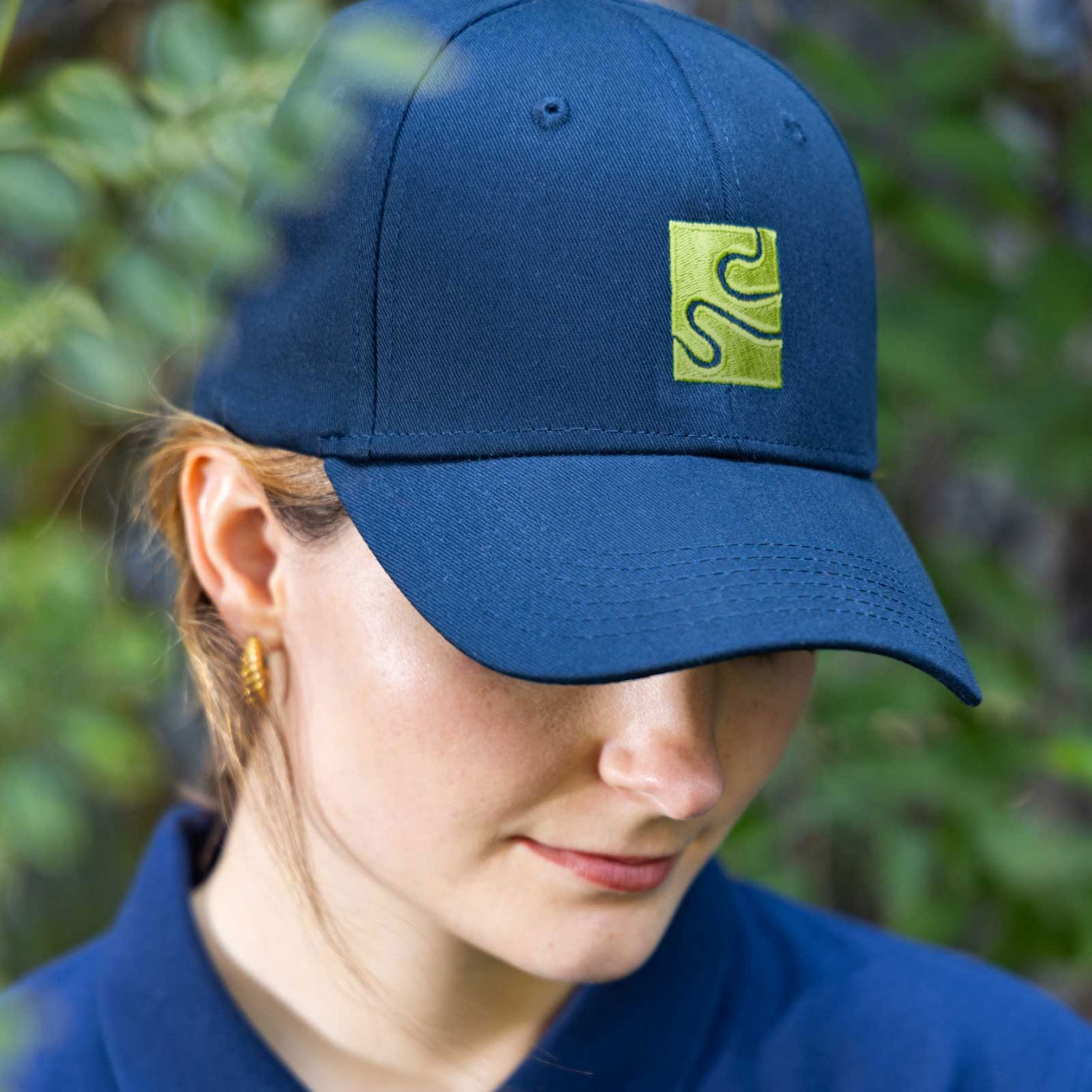
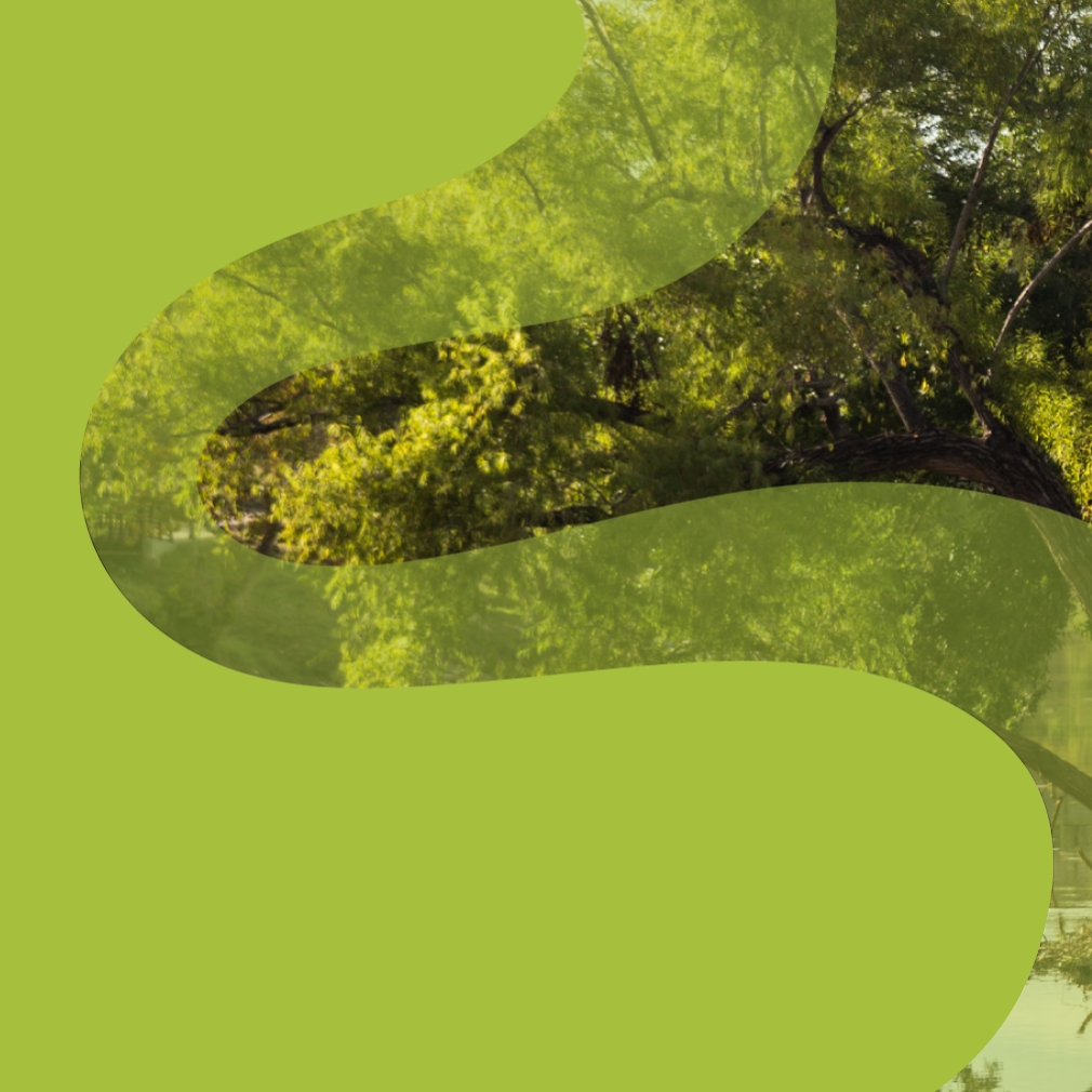
The thread icon may be used with or without brand typography for a variety of applications—over full-bleed photography, with interwoven text, or alongside ancillary images. Figuratively, it is BBP’s “thread”—connecting and weaving together places, spaces, and people.
Small + Large Image
Text
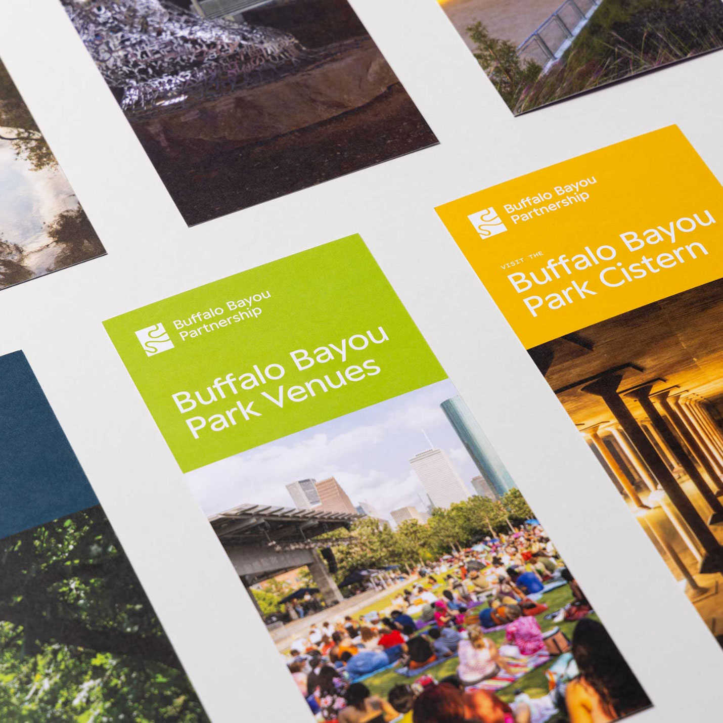
The brand’s new typographic expression consists of three families: Peak, Surf, and Pitch Sans. Together these typefaces evoke a sense of clean sophistication. Primary typeface Peak blends geometric and calligraphic curves. A customized “ff” ligature connects the bars of both characters, like a bridge, to create a single glyph.
Single Image + Caption
Text
Inspired by colors of the bayou and its surroundings, BBP’s new color palette is grounded in rich environmental hues—starting with deep blue-green Basin, off-white Dew, and verdant Grove. An array of naturally vibrant supporting colors pair with Dew and Basin. These supporting hues assist in expressing the architecture of the brand and programmatic hierarchies.
Large + Small Image
Text
BBP’s new website was designed to showcase all that the organization is and does, while offering users a highly efficient, decidedly evocative digital experience.
Single Image + Caption
Left Image + Right Caption
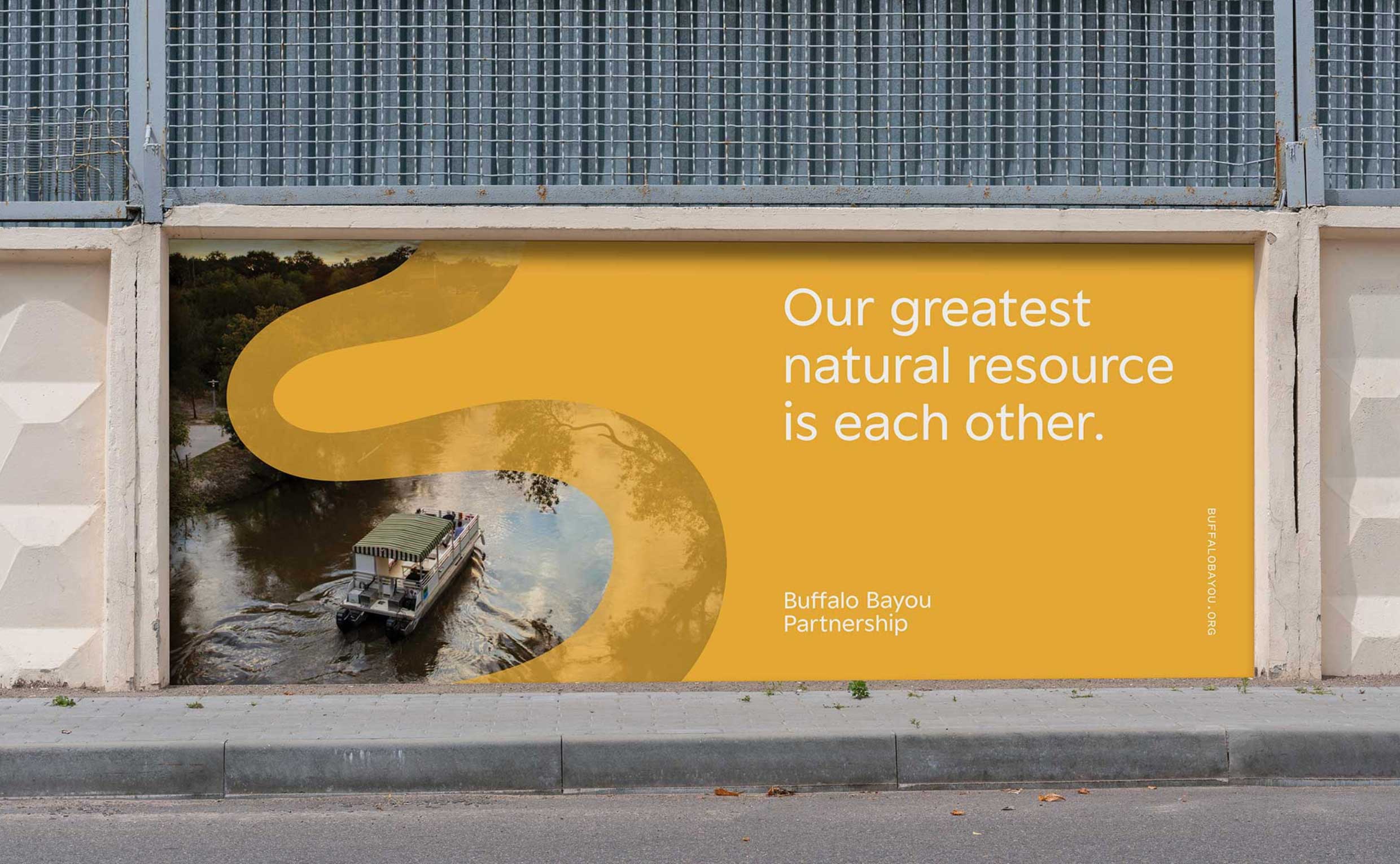
Containing many levels of information—from mission diagrams to overviews of public spaces to events and updates—the home page establishes the site’s driving thesis: that BBP is more than just a park (and that, yes, BBP does offer boat tours).
Text
To revitalize a brand in the business of revitalizing—this was the task of our brand work with BBP. We look forward to bearing witness to—and continuing to be gracious beneficiaries of—BBP’s ongoing, hugely impactful work on behalf of all Houstonians.
Small + Large Image
Single Image + Caption
