People & Purpose
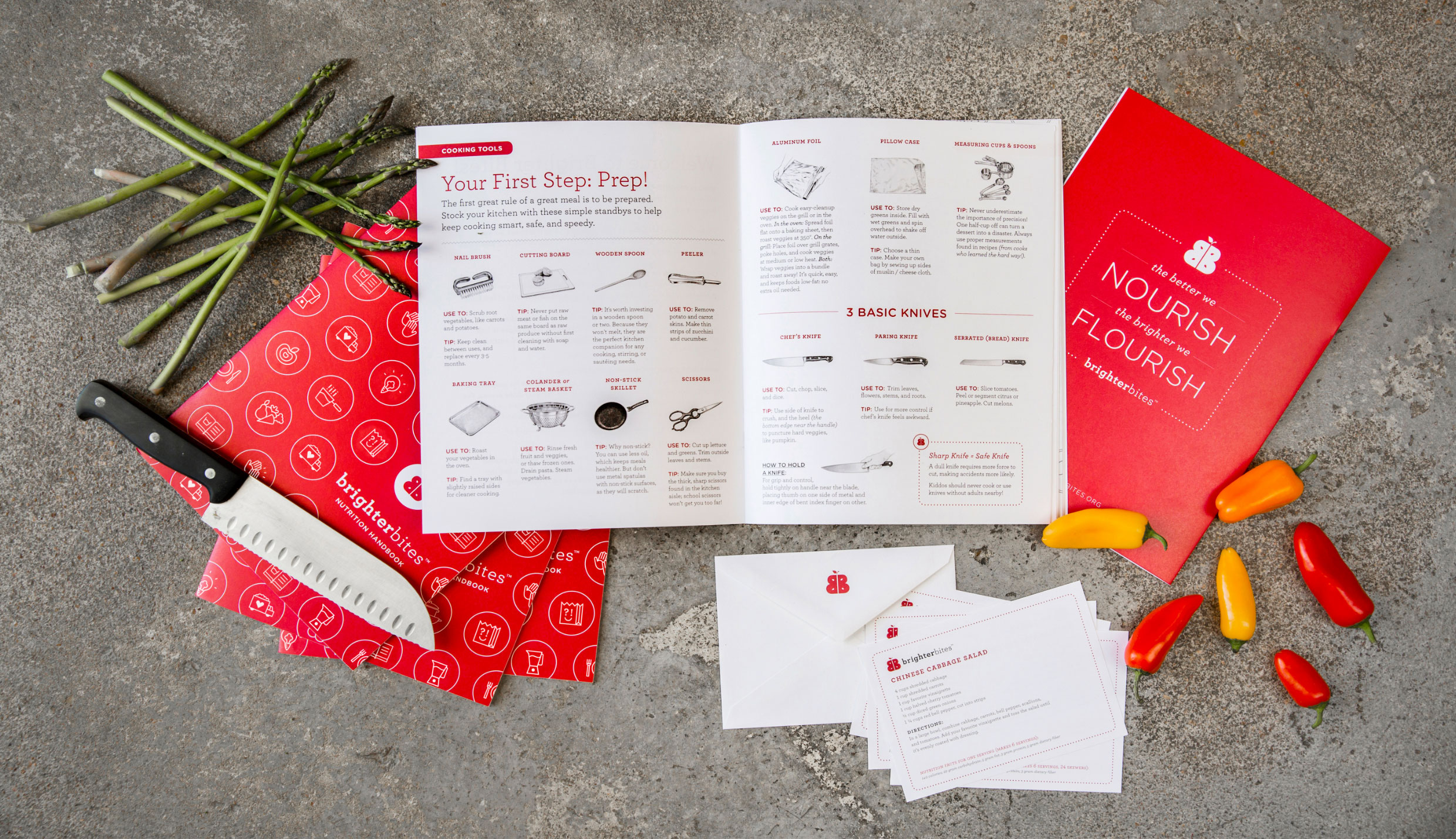
A colorful co-op homegrown in Houston, Brighter Bites is a nonprofit whose mission is to provide fresh produce and nutrition education to children in underserved areas. This client will always hold a special place in our hearts, as the project marked our first fully integrated brand system, verbal and visual, from name and logo and language and typography to a friendly suite of educational and promotional materials that span printed and digital environments. As their organization grew, so did our own, and we’re grateful for both the experience we gained as their brand partners as well as the chance to champion a cause we simply love.
Services
- Brand Strategy
- Naming & Verbal Identity
- Visual Identity
- Writing
- Copyediting
- Website Design
- Print System
- Presentation Materials
- Brand Guidelines
- Merch System
Partners
- Kudos NYC
- Julie Soefer
- Shea O’Connor
Left Image + Right Caption
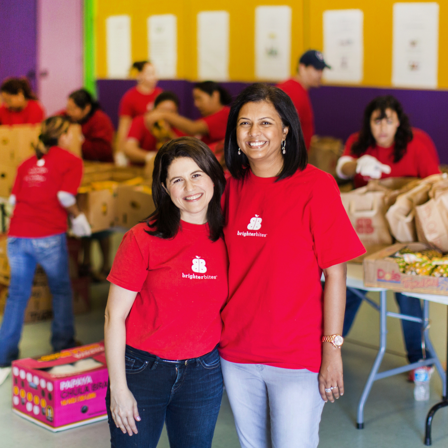
Brighter Bites is the brainchild of Lisa Helfman and Dr. Shreela Sharma. For several years, Lisa and her family took part in a weekly fruit and vegetable co-op, and she watched her kids’ eating habits dramatically transform. So much so that her little boy once turned down a piece of cake at a birthday party, claiming it was too sweet—a fair revelation for any six-year-old.
Text
Lisa wondered what kind of influence regular access to fresh produce might have on all children, especially if it were free to families. She was inspired to replicate this type of positive change in underserved communities identified as “food deserts,” or areas where access to grocery stores stocked with fresh fruits and vegetables is sorely limited.
Single Image + Caption
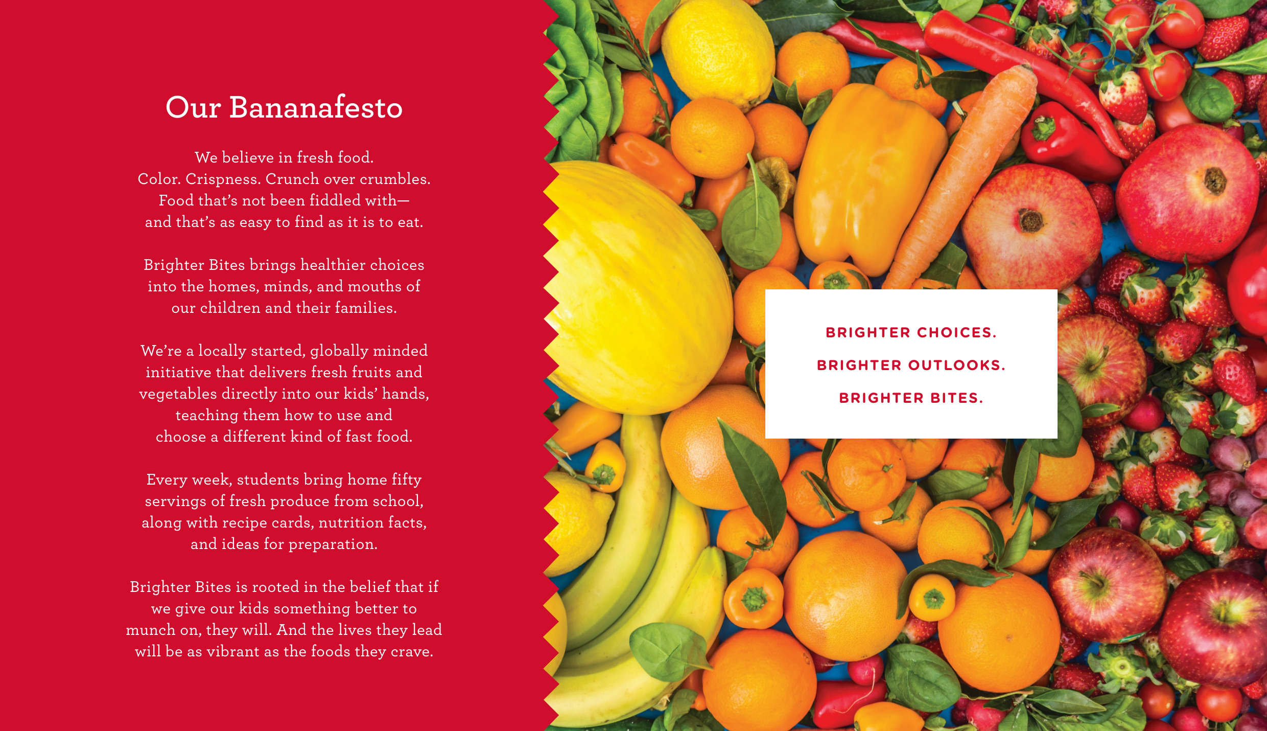
We were introduced to this wonderful idea by way of a formal, scientific abstract. A friendly ‘Bananafesto’ and a pithy new name synthesized the concept and added appeal.
Text
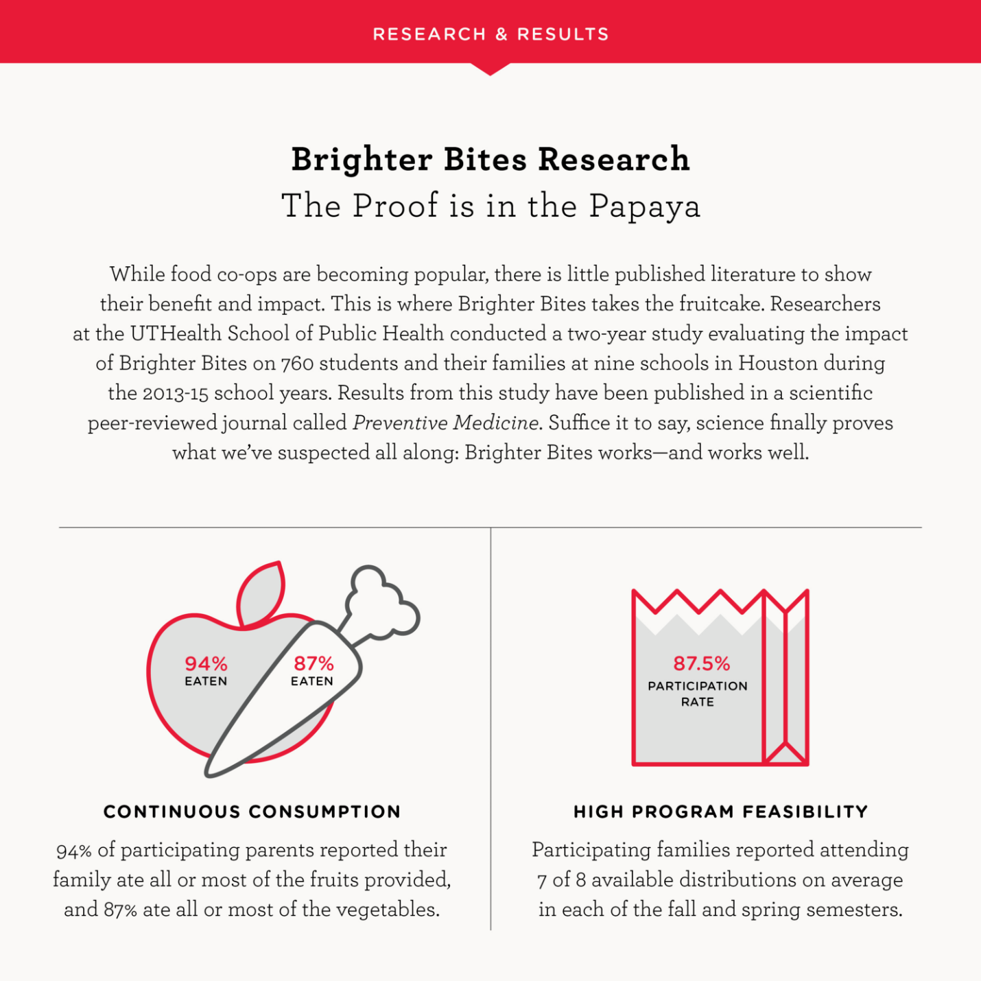
Because nutrition education in food desert communities is often equally lacking, Lisa’s vision was to bring a produce co-op to schools in these neighborhoods that included an educational component. To start, she created a collaborative partnership with Dr. Shreela Sharma, an expert in nutrition and a professor of epidemiology at UTHealth School of Public Health, and they launched the program now known as Brighter Bites.
Single Image + Caption
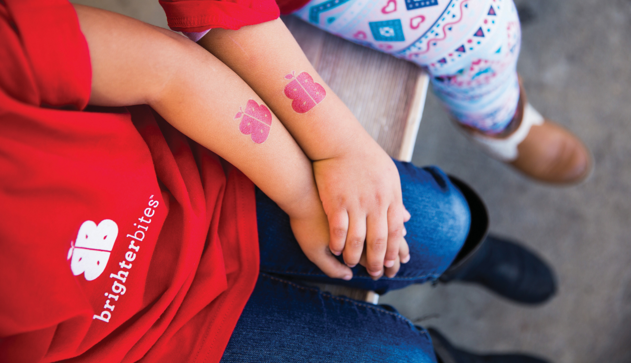
Bold back-to-back Bs are reminiscent of slicing into something fresh and delicious.
Text
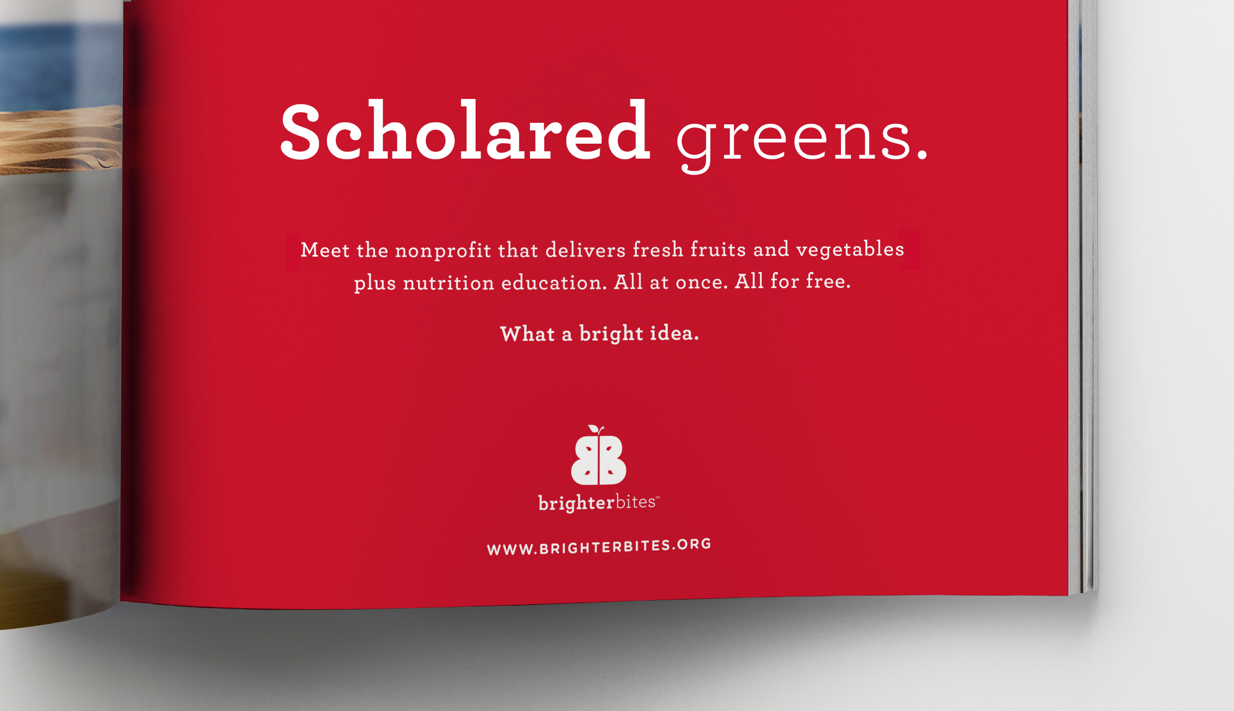
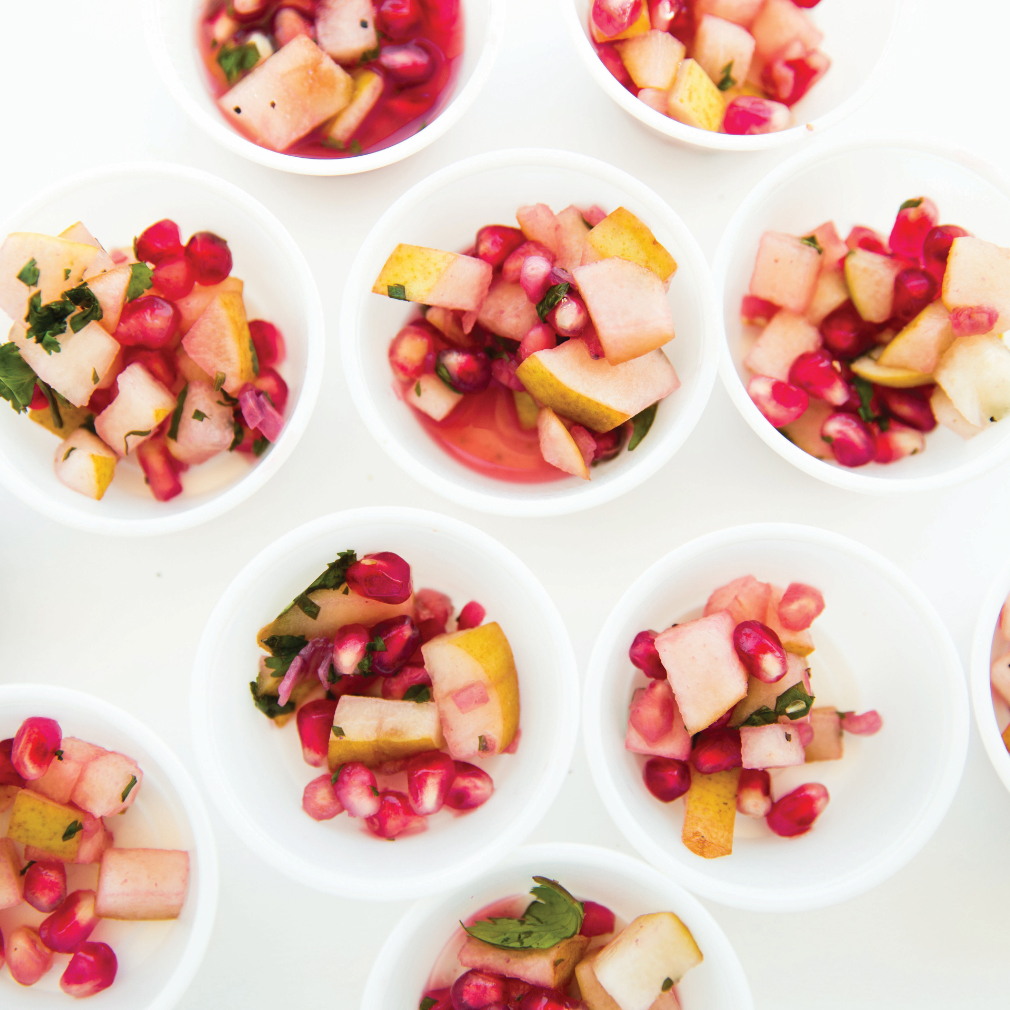
The name came about from a simple observation: the more color on your plate, the more nutrition you intake. “Brighter Bites” sets the tone for all program materials: smart, optimistic, and catchy, with equal emphasis on both the bright bounty of produce they deliver as well as the bright choices they encourage kids to make.
Small + Large Image
Text
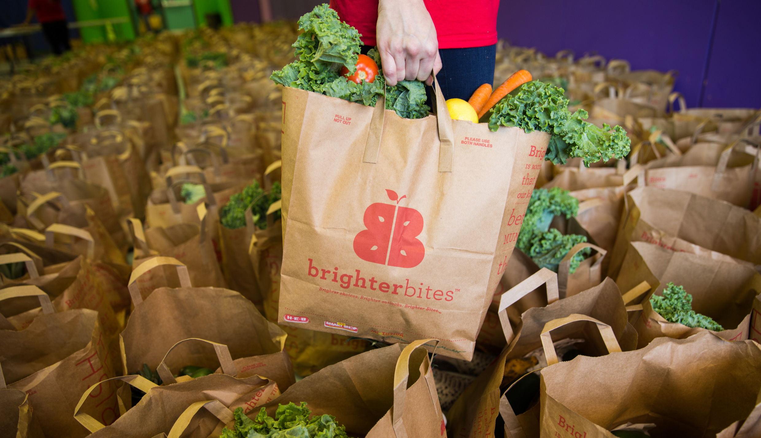
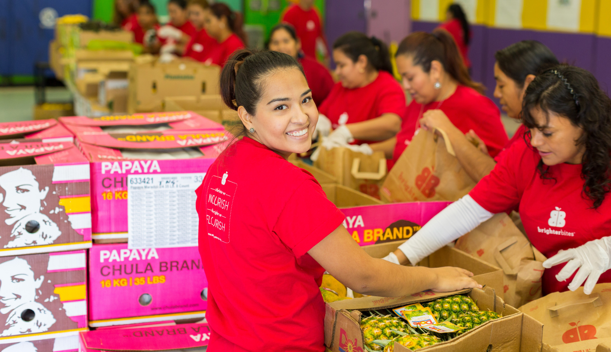
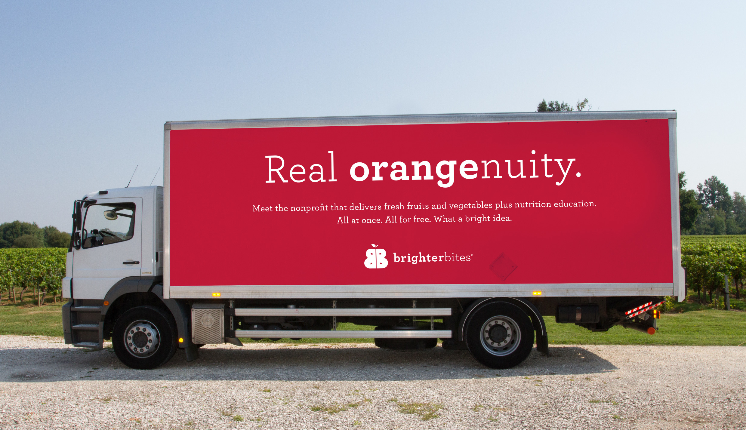
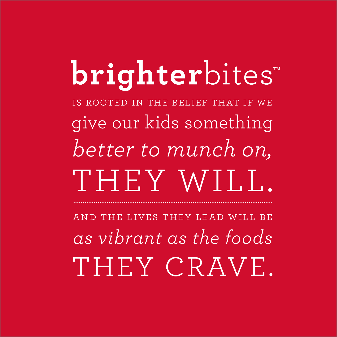
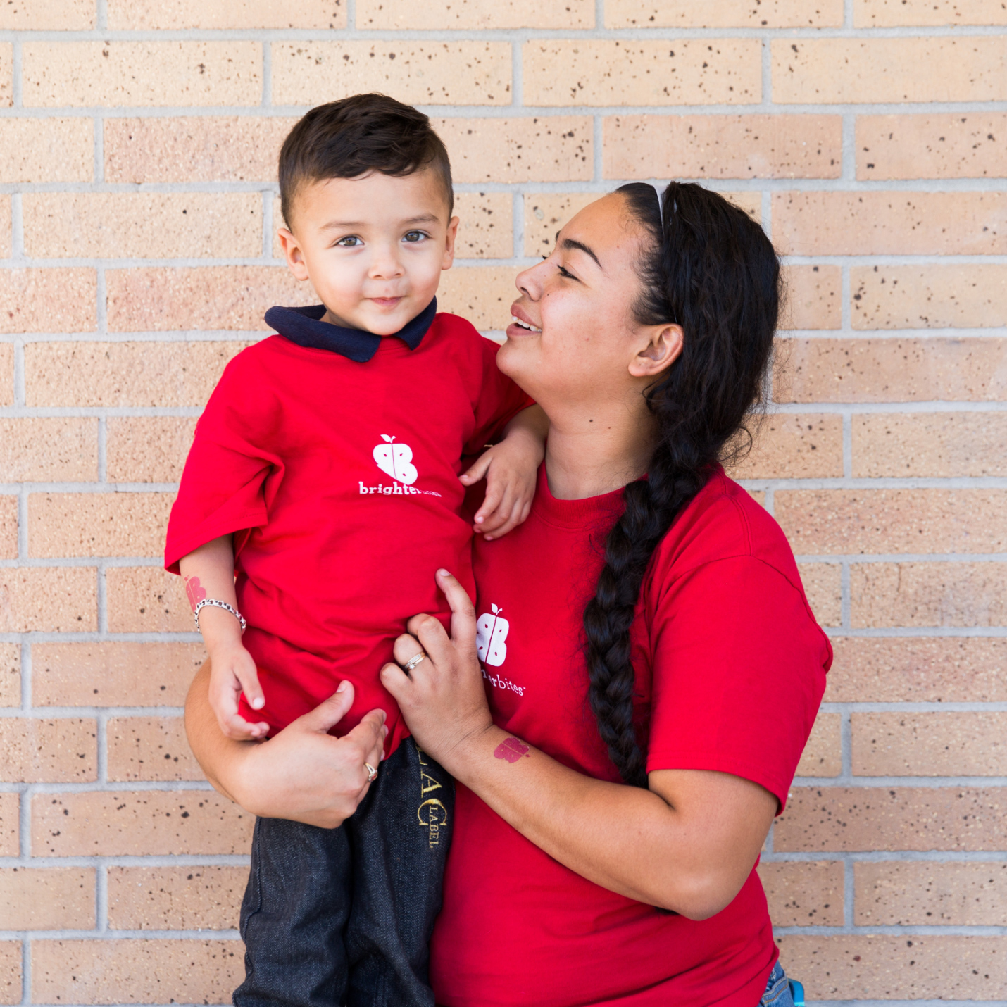
Since cost was a key consideration as a start-up nonprofit, so was color. We chose a crisp, striking palette of red and white 1) to deviate from the green hues that typically mark health-related initiatives, and 2) because a one-color application for high-volume needs—like their volunteer tees or the thousands of bags packed with produce families take home each week—was both stand-out fresh and fiscally prudent.
Large + Small Image
Single Image + Caption
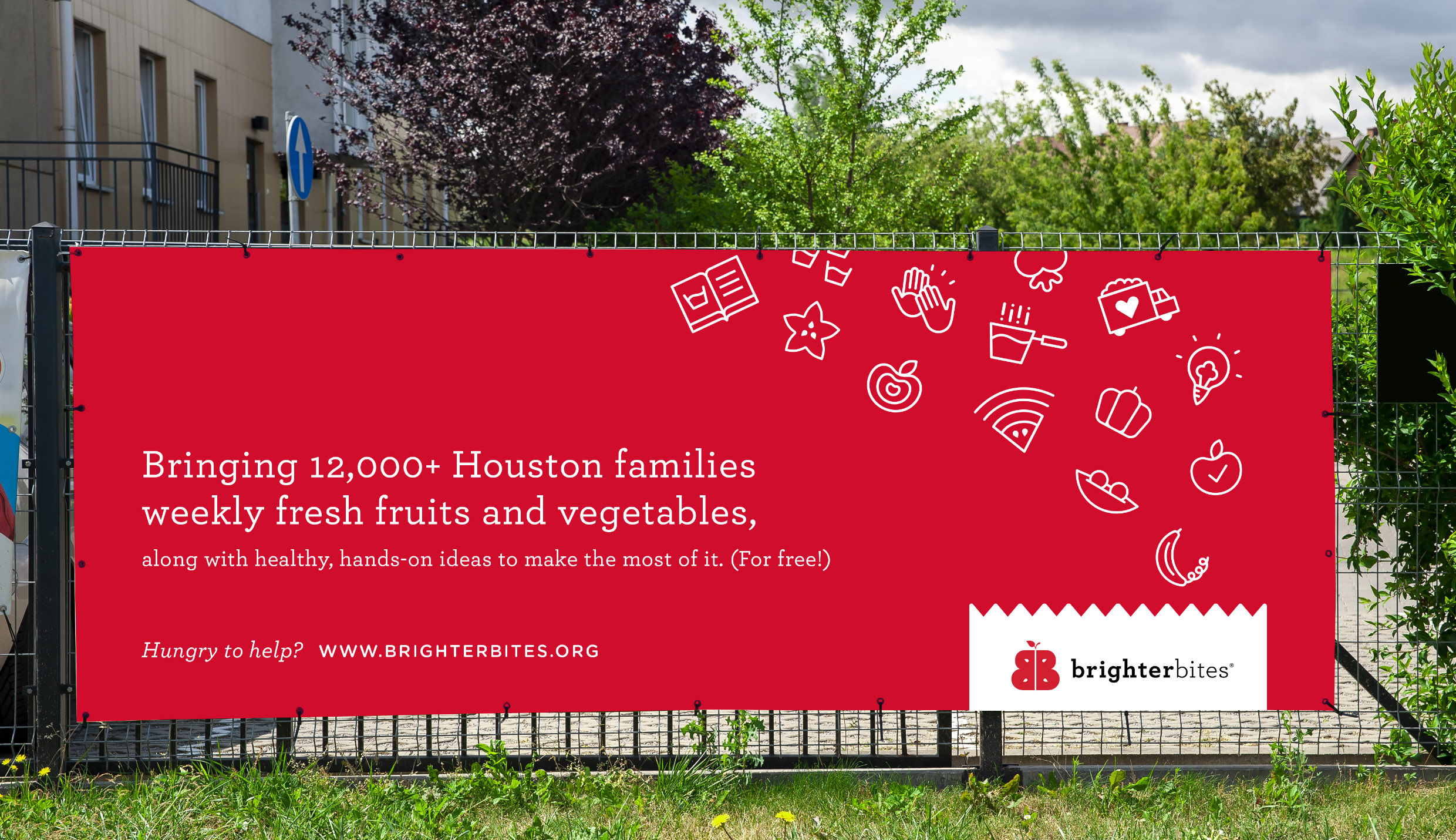
Our favorite is a toss-up between the watermelon wifi and the banana phone.
Left Image + Right Caption
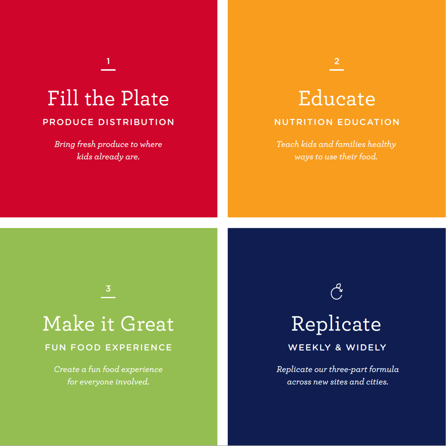
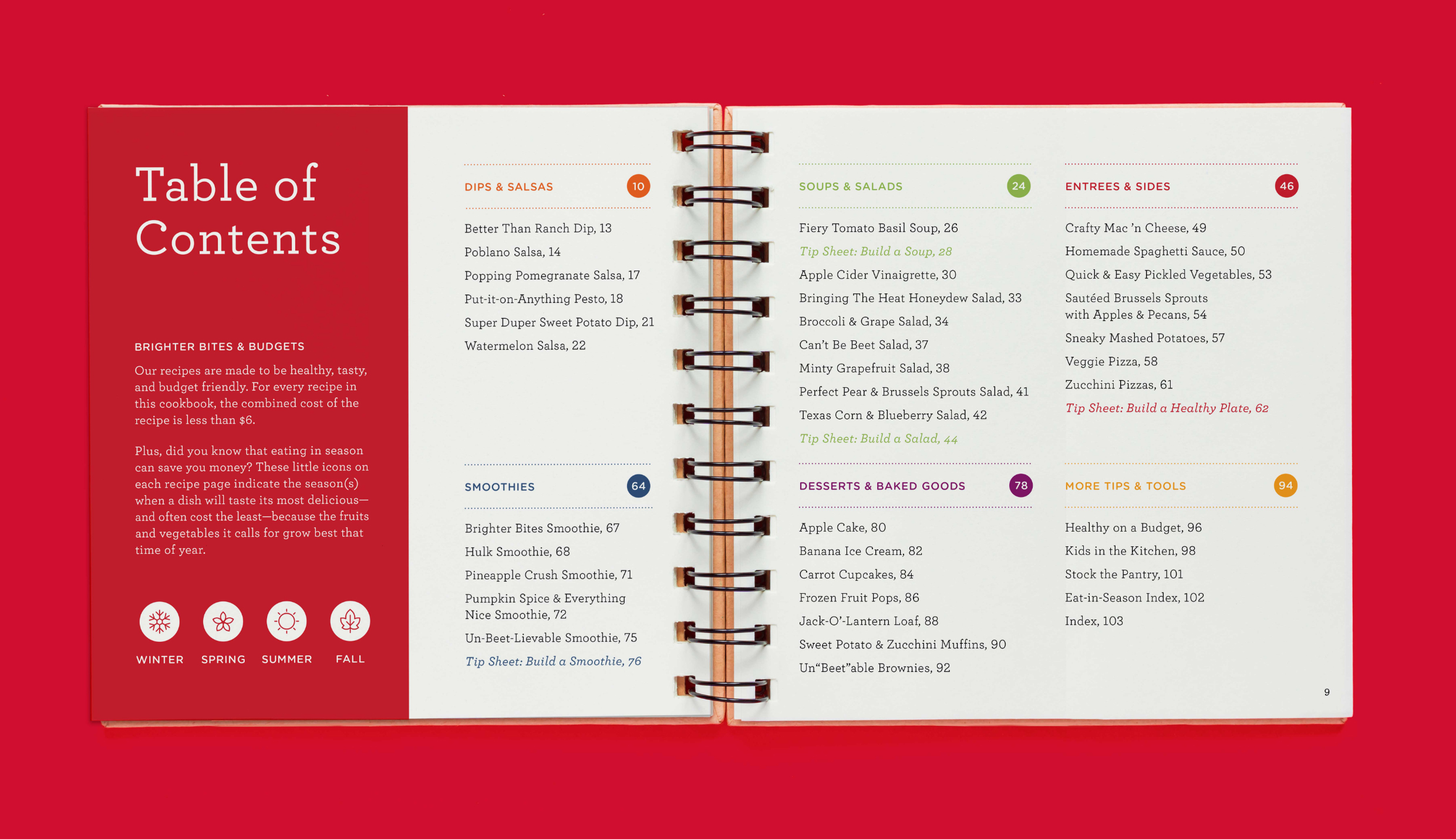
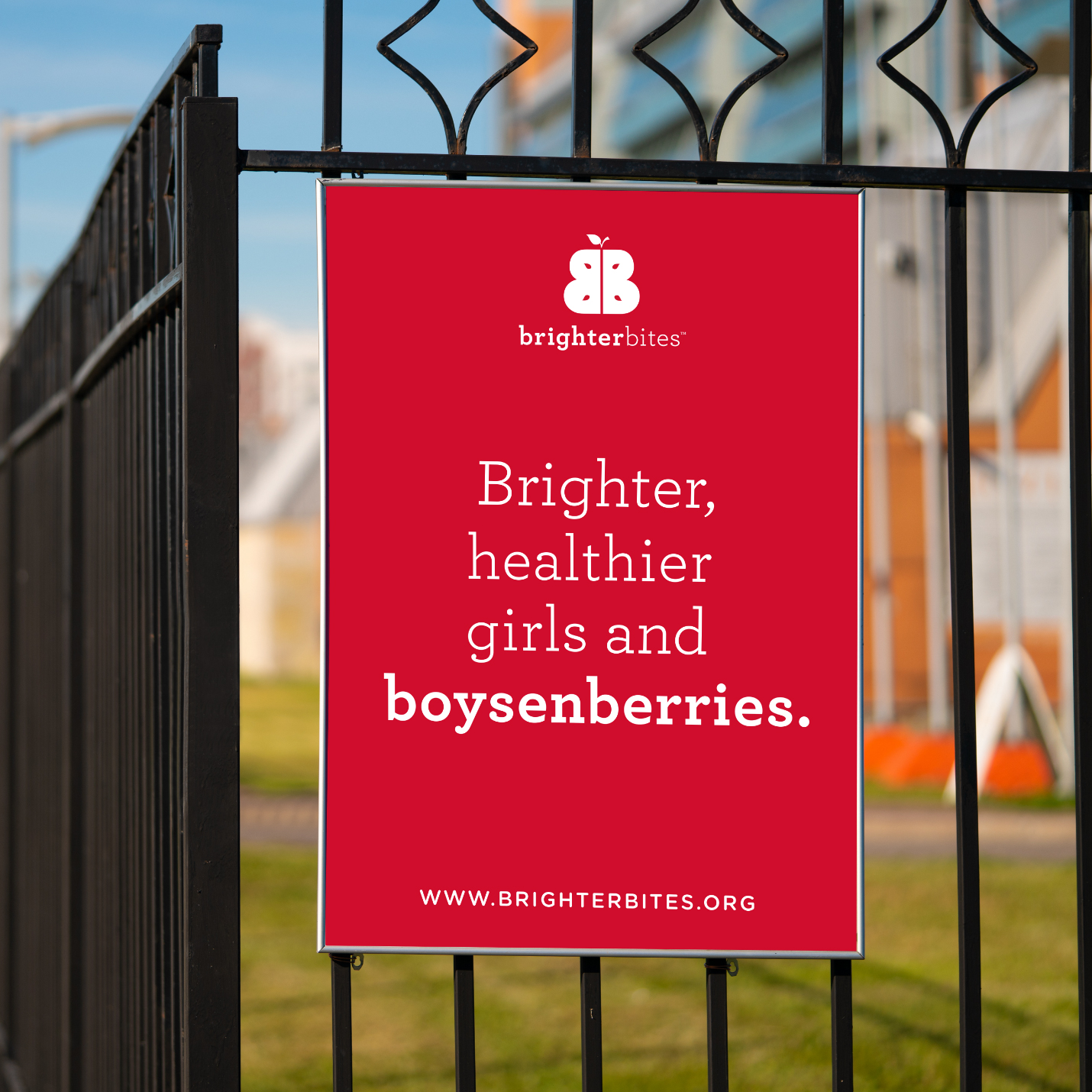
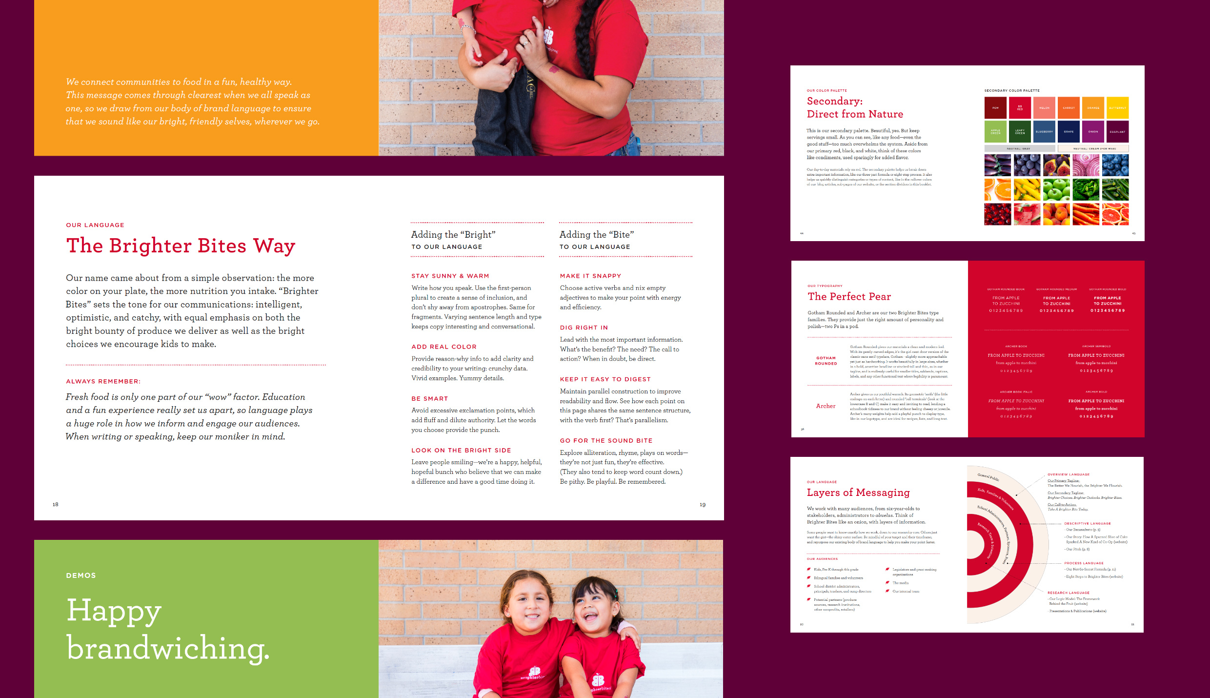
Typography and language work hand in hand to give Brighter Bites oodles of personality. As they introduced their brand and idea to a wide range of audiences—from investors and administrators to abuelas and eight-year-olds—it was important that all materials feel clean, credible, inviting, and informative.
Small + Large Image

Single Image + Caption
Text
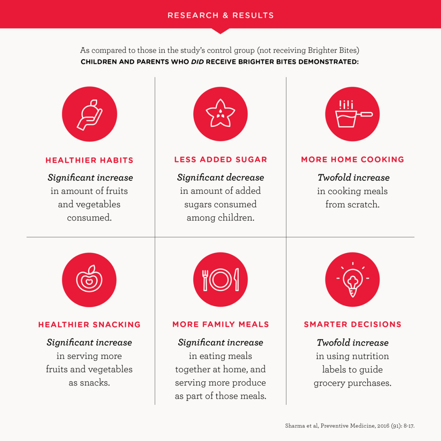
Since their inception in 2012, Brighter Bites has delivered—amazingly—more than 40,000,000 pounds of fresh produce and millions of nutrition education materials to more than 475,000 kids, caretakers, and teachers in schools and cities across the country. They’ve built a team and a process that continues to thrive and change communities, and we are so proud to remember when they were just a Word doc and a dream.
Single Image + Caption
